Written by George Lewis— Head of Data Visualization & AI Solutions.
Updated Oct 12, 2026·7 min read
Most "free" AI dashboard tools still make you create an account before you can download anything. Dashboard Builder's AI Dashboard Generator doesn't. Upload a CSV, Excel file, or a PDF with a table in it, then choose how you want to work:
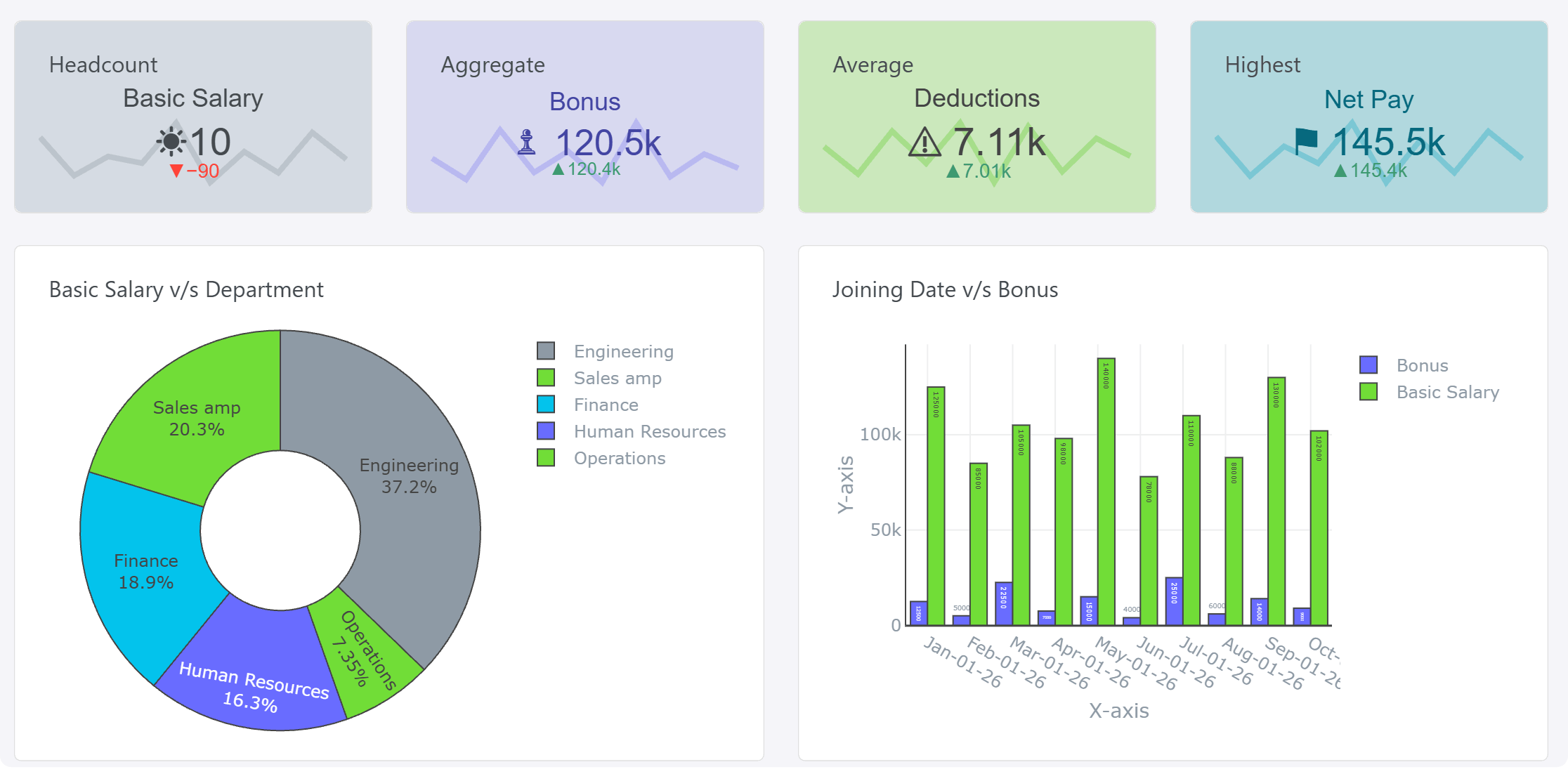
Auto mode: the AI analyzes your file and builds a complete dashboard in seconds, with 4 KPI cards, 6 charts and a Key Insights panel that explains what stands out in your data.
Chat mode: type what you want in plain English, such as "Generate a pie chart to show age and income", and it creates that chart from your data.
No sign-up, no credit card, and no watermark on the free tier to generate and download. If you want to keep editing your dashboard later, sign up to save it in your control panel.
An AI dashboard generator takes raw data, such as a spreadsheet, a CSV or a table inside a PDF, and decides how to visualize it. It picks the KPIs, chart types, colors, labels and layout for you, so you don't build each chart cell by cell. Instead of choosing axes and formatting legends by hand in Excel, you upload your data and either let the AI build the whole dashboard or ask it for the exact chart you need. You can then change the chart types, colors and titles to suit.
The stakes of getting this right are higher than they look. Charts built from business data often feed real decisions, not just decorate a slide. A chart that's easy to misread — or that quietly buries a trend under bad color choices — can send a decision the wrong way just as easily as bad data can.
How Our Free AI Dashboard Generator Works
Applies to: On-premises ✅ Online ✅ Desktop ✅
No account, no email verification, no trial that expires — you can generate and download a dashboard anonymously. To keep editing it and come back to it later, sign up and save it to your control panel.
1
Upload your data. Drop in a CSV, Excel (.xlsx / .xls), or a PDF file with a table in it.
2
Pick Auto mode or Chat mode. In Auto mode, the AI reads your data and builds a complete dashboard with 4 KPI cards and 6 charts, choosing line, bar, pie or other chart types based on whether each field is a trend, a comparison or a part-to-whole breakdown. In Chat mode, type a prompt such as "Generate a pie chart to show age and income" and it builds that one chart. You can override any choice.
3
Customize colors, labels, and legend. Adjust the palette, axis labels, and title, or apply one of Dashboard Builder's saved color themes for brand consistency.
4
Download instantly — PNG, PDF, HTML, PHP, Laravel, WordPress plugin or Joomla plugin. No watermark, no locked export tier,
Import From CSV, Excel, or PDF — No Reformatting Needed
Most AI chart tools only accept CSV or a pasted table. Dashboard Builder's AI Dashboard Generator also reads data straight out of PDFs, which matters if your numbers live in a scanned report, an invoice, or a document someone emailed you rather than a tidy spreadsheet.
CSV & Excel (.csv / .xlsx / .xls):
Drag in any comma-separated file, or upload a workbook you want charted. Column headers are auto-detected and mapped to axes automatically.
PDF: Upload a PDF containing a table (a report, statement, or printed spreadsheet) and the AI extracts the table data before charting it.
If your data needs cleaning first — merged cells, inconsistent date formats, stray totals rows — the AI flags likely issues before charting so you're not debugging a chart that's actually a data problem.
How to Choose the Right Chart Type
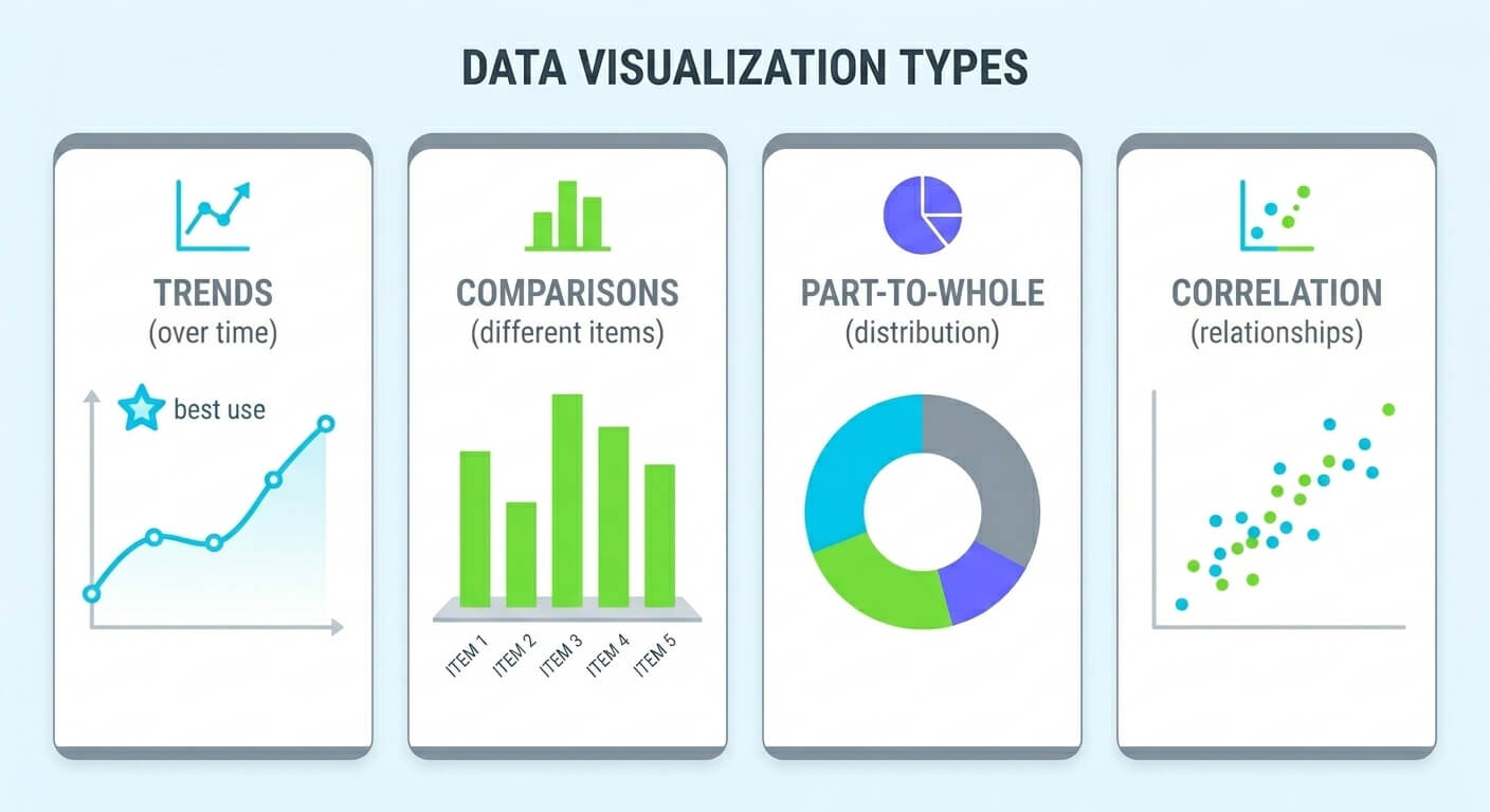
In Auto mode the AI picks chart types for you, but it helps to know the reasoning so you can override it when your case is unusual. As a rule of thumb, let what you're trying to show — not the data's shape alone — decide the chart:
Showing a trend over time: Use a line chart. It's the clearest way to show a value rising, falling, or fluctuating across days, months, or years.
Comparing categories: Use a bar chart. Bars are easier to compare at a glance than pie slices once you have more than 3–4 categories.
Showing part-to-whole: Use a pie or donut chart — but only with 5 or fewer segments. Beyond that, a bar chart reads faster.
Showing relationships between two variables: Use a scatter plot to reveal correlation or clusters that a bar or line chart would hide.
Showing composition over time: Use a stacked area or stacked bar chart, e.g. revenue by product line across quarters.
Showing distribution: Use a histogram to show how values in a dataset are spread out, e.g. order sizes or response times.
6 Chart Design Mistakes That Confuse Readers
1
Truncated y-axis. Starting the y-axis at a number other than zero on a bar chart exaggerates small differences and can mislead readers about the actual size of a change.
2
Too many colors in one chart. Past 6–7 distinct series, most readers can no longer reliably match a color in the legend back to a bar or line.
3
Using a pie chart for too many categories. Once you're past 5 slices, a pie chart turns into a guessing game. Switch to a horizontal bar chart instead.
4
3D effects on 2D data. 3D bar and pie charts distort the actual proportions due to perspective, making values look larger or smaller than they are.
5
No data labels on precise figures. If the exact number matters (a budget, a target), label it directly on the chart instead of making readers estimate from the axis.
6
Ignoring colorblind accessibility. Red-green palettes are indistinguishable to some readers. Use Dashboard Builder's built-in colorblind-safe palettes or pair colors with patterns or labels.
Dashboard Builder vs. Excel vs. Other AI Tools
Every tool here can produce a decent chart. The differences show up in how much friction is between your data and the finished chart.
Features
Dashboard Builder AI
Excel / Google Sheets
Typical AI Design Tools
Sign-up required
No (only to save & edit later)
No (if already installed)
Usually, before export
Free to use
Yes, full charting
Yes, if you own a license
Often limited/watermarked
Imports CSV
Yes
Yes
Usually
Imports Excel
Yes
Native
Sometimes
Imports PDF tables
Yes
No
Rarely
Builds a full dashboard automatically
Yes (4 KPIs + 6 charts)
No (manual)
Rarely
Best for
Fast, data-first charts & dashboards
Deep spreadsheet analysis
Highly stylized, presentation-first visuals
If your priority is polished, presentation-style infographics with heavy branding, a design-first tool may still suit you better. If your priority is getting from a spreadsheet or PDF report to an accurate chart with the least friction, that's what Dashboard Builder's AI Dashboard Generator is built for.
No. You can upload your file, generate a dashboard or chart, and download it without signing up. You only need to sign up if you want to keep editing the dashboard later and save it in your control panel.
Dashboard and chart generation, customization, and export (PNG, PDF, HTML, PHP, Laravel, WordPress plugin or Joomla plugin) are free with no watermark. Paid plans exist for teams who want to save dashboards to a shared control panel, schedule live data refreshes, or apply auto-branding across many charts.
Upload the file, then choose a mode. In Auto mode the AI builds a complete dashboard with 4 KPI cards and 6 charts. In Chat mode you type a prompt such as "Generate a pie chart to show age and income" and it creates that chart from your data. Either way, the AI maps your columns to axes and picks the chart type — no manual formatting required.
You can upload a PDF that contains a table and the AI extracts the table data before charting it, in addition to native CSV and Excel (.xlsx/.xls) support.
It looks at the shape of your data — trend over time, comparison across categories, part-to-whole breakdown, or relationship between two variables — and recommends a line, bar, pie, or scatter chart accordingly. You can override the suggestion.
Yes. Alongside the KPIs and charts, Auto mode adds a Key Insights panel that explains what stands out in your data in plain English. For example, from a payroll file it might report that Engineering achieved the highest Basic Salary with 395,000.00, accounting for 37.2% of the total; that total Bonus reached 120,500.00 across 10 items; and that while Engineering leads in Basic Salary, its Bonus is also higher than average at 41,500.00.
It removes the manual steps most likely to introduce errors — mismatched axes, wrong chart type for the data, inconsistent color mapping — and picks sensible defaults automatically. What normally takes several minutes of manual formatting in a spreadsheet tool takes seconds, without the axis or data-mapping mistakes that creep in when it's done by hand.
It depends on your priority. For getting from a raw spreadsheet or PDF report to an accurate chart with the least friction and no sign-up, Dashboard Builder is built for that specifically. For heavily branded, presentation-style infographics, a design-first tool may suit you better — see the comparison table above for a fuller breakdown.
Dashboard Builder's AI Dashboard Generator is built for data-driven charts — bar, line, pie, scatter, and similar — not process flowcharts or diagramming. If you need to map out a workflow or decision tree rather than visualize a dataset, a dedicated flowchart or diagramming tool will serve you better.
The most common culprits are a y-axis that doesn't start at zero, too many colors in one chart, and 3D effects that distort proportions. Dashboard Builder's AI defaults avoid all three, but they're worth checking manually if you override the suggested settings.
Yes. Files you upload to generate a chart are used only to build that chart and are not required to be linked to an account, since no sign-up is needed to use the tool.
Yes. Any chart you generate can be added to a Dashboard Builder dashboard alongside other tiles, where it can pull from a live, refreshing data source instead of a one-time file upload.
See the Dashboard Builder documentation for step-by-step walkthroughs covering multi-series charts, combining CSV and PDF sources, and applying custom color themes, along with video walkthroughs for more complex chart-building workflows.
No. The AI needs your data to chart, so you always start by uploading a CSV, Excel or PDF file. After that, Chat mode lets you ask for any chart in plain English, such as "show monthly revenue by region as a bar chart".
Auto mode builds a complete dashboard for you in one step: 4 KPI cards and 6 charts chosen from your data. Chat mode builds one chart at a time from a plain-English prompt, so you control exactly what gets visualized.