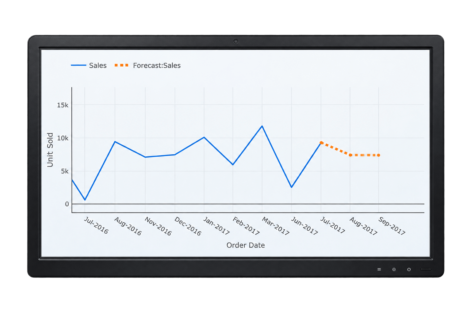

A forecasting dashboard analyzes your historical data to predict future outcomes — a technique known as predictive analytics. Whether you're projecting sales, revenue, or how many people you'll need to hire next quarter, the same underlying idea applies: use what's already happened to make a defensible statement about what's likely to happen next.
On this page
- What Is a Forecasting Dashboard?
- The 4 Types of Forecasting
- The 7 Steps of Forecasting
- How Forecasting Works in Dashboard Builder
- How to Build a Forecast (Step-by-Step)
- Comparing Dashboard Applications for Forecasting
- Creating a Headcount Forecast Leadership Will Actually Use
- The Simplest Way to Forecast Staff Numbers
- Building a Dashboard That Shows Future Hiring Needs
- Requirements & Installation
- Frequently Asked Questions
What Is a Forecasting Dashboard?
A forecasting dashboard aggregates and analyzes historical data to anticipate future outcomes at a glance. It can't predict exactly what will happen, but it helps you identify trends, spot disruptive changes early, and make decisions based on where the data is heading — not just where it's been.

The 4 Types of Forecasting
Forecasting methods generally fall into four categories, distinguished mainly by whether they rely on hard numbers, expert judgment, or a mix of both:
Dashboard Builder's built-in forecast function is a time series method — it projects your existing trend line forward. If you want to factor in other variables (like tying a headcount forecast to projected revenue), that's a causal approach, and pairing the forecast with AI Dashboard's natural-language analysis lets you explore those relationships without building a separate regression model by hand.
The 7 Steps of Forecasting
This sequence is adapted from the standard operations-management forecasting process, in plain language:
Decide what the forecast is for. A budget decision needs different precision than a rough planning conversation — know which one you're solving before you start.
Pick what you're forecasting. Total headcount, headcount by department, revenue, or units sold — be specific, since each needs slightly different data.
Set the time horizon. Next quarter, next fiscal year, or the next five years each call for a different method and a different tolerance for error.
Choose your method. Time series if you have solid history; causal if you're tying the forecast to another driver like revenue; qualitative if the historical data isn't there yet.
Gather and clean the data. This is usually where forecasts actually go wrong — inconsistent date formats, missing months, or duplicated records will throw off a regression line badly.
Generate the forecast. Run the model — in Dashboard Builder, this is the Forecast option on the Analytics tab.
Validate, then revisit it. Check the forecast against what actually happens once real numbers come in, and update the model — a forecast built once and never revisited gets less useful every month.
How Forecasting Works in Dashboard Builder
The forecast function computes a linear trend line based on your existing data, then calculates predicted Y values for new X values you specify — for example, predicting next month's headcount (Y) based on the date (X). This uses the least-squares method: it finds the line that minimizes the distance between itself and your actual data points, then extends that line forward. For this to work well, your X-axis needs to be a date field and the underlying trend needs to be reasonably linear.
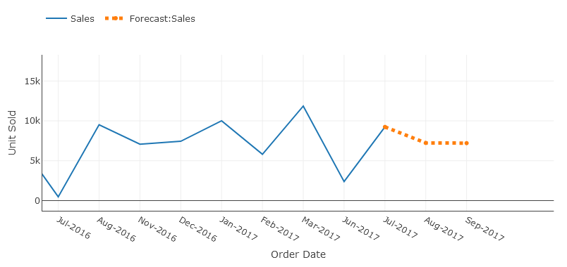
How to Build a Forecast (Step-by-Step)
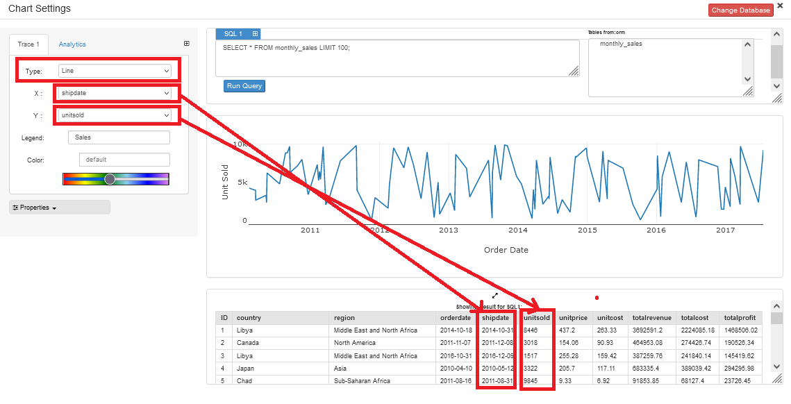
Launch Dashboard Builder and connect your database by clicking the Database icon, entering credentials, and saving.
Build a line chart with a date field on the X-axis and your metric on the Y-axis.
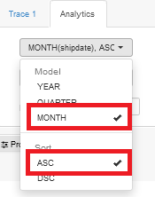
Aggregate your data on the Analytics tab — for example, count headcount or sum sales by month, sorted ascending.
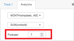
Enable Forecast — this only becomes available once your X-axis is a date field.
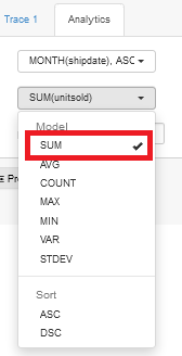
Set your iterations and save. Choose how many future periods to project, save, and your forecast is ready to publish.
Ready to try it? Download Dashboard Builder for free and build your first forecast today.
Comparing Dashboard Applications for Business Forecasting
Most BI tools have some kind of forecasting, but the setup effort and cost differ a lot:
| Dashboard Builder | Excel / Sheets | Power BI | Tableau | |
|---|---|---|---|---|
| Built-in forecast | Yes (least-squares, one click) | Yes (FORECAST/TREND functions) | Yes (exponential smoothing) | Yes (exponential smoothing) |
| Setup effort | Low — no formulas | Medium — formula knowledge needed | Medium — desktop app + modeling | Medium-High — steeper learning curve |
| Price | Free | Free with Office/Google account | ~$10–14/user/mo | ~$75–115/user/mo |
| Hosting | Self-hosted or cloud, your choice | Local file or cloud | Microsoft cloud | Tableau Cloud/Server |
| Best for | Quick, no-code forecasts from any database | One-off, ad hoc forecasts | Teams already on Microsoft stack | Large enterprise BI deployments |
Pricing shown is publicly listed as of 2026 and subject to change; check each vendor's current pricing before deciding.
Creating a Headcount Forecast Leadership Will Actually Use
Most headcount forecasts fail for the same reason: they're built for the person making them, not the person approving them. A spreadsheet with 40 rows of role-by-role detail might be accurate, but if your boss can't see the point in ten seconds, it won't get used in the budget conversation. Here's what actually holds up in that room.
What leadership actually wants to see
- A single trend line, not a table. Current headcount, where it's heading if nothing changes, and where you're proposing it should go instead.
- The "why." Headcount tied to a business driver — revenue growth, project pipeline, or ticket volume — is far more persuasive than headcount justified by itself.
- A cost, not just a count. Convert the number of hires into a fully-loaded cost figure. Budget conversations happen in dollars, not headcount.
- A range, not a false-precision number. "Between 4 and 7 hires" is more credible than a single number that implies certainty you don't have.
Common mistakes that get a forecast rejected
- Presenting every role individually instead of rolling up to department or function level first, then letting someone drill in if they want detail.
- Ignoring attrition — a forecast that only counts planned new hires and not expected departures will overstate your ending headcount.
- Building it once a year and never updating it — a forecast that's six months stale by budget season has already lost credibility.
How to build it in Dashboard Builder
Connect your HR data (an HRIS export or a simple CSV works fine) and build a monthly headcount trend by counting active employees per month, going back at least 12 months for a meaningful pattern. Layer in your historical attrition rate as a separate calculation, and use the Forecast function to project the trend forward — this gives you the "if nothing changes" baseline. Then add a second series showing your planned/target headcount from the budget, so the gap between the two lines is your hiring ask, visually, without needing to explain it in words.
The Simplest Way to Forecast Staff Numbers
If you don't need statistical rigor — you just need a defensible number fast — two simple methods cover most situations, and you can use them together to sanity-check each other.
The most convincing version of a simple forecast uses both: the ratio method tells you what headcount should be given the plan, and trend extrapolation tells you what it will be if you do nothing. The gap between those two numbers is your hiring plan — and it's a much easier thing to defend than either number on its own.
Building a Dashboard That Shows Future Hiring Needs
Once you have a method, turning it into something you can actually present is a short build:
Gather your data. Current headcount by department or role, hire dates, termination dates (for attrition), and any planned open requisitions from your budget.
Build the historical trend. A line chart with month on the X-axis and active headcount count on the Y-axis, going back at least a year.
Enable Forecast to project that trend forward as your no-intervention baseline.
Overlay your target headcount as a second line on the same chart, pulled from your approved budget or plan — this is what turns a forecast into a hiring case.
Break it out by department using a filter or a small multiple of charts, so it's clear exactly where the hiring gap is concentrated, not just that one exists.
Publish and share the dashboard with a live link, so the forecast updates automatically as new hires and departures happen — instead of going stale the moment you export a static slide.
Requirements & Installation
Prerequisites
- PHP Version 7 or later
- Apache 2 or later
- JSON enabled
Installation
- Download the free version from the download page.
- Place the files in a directory on your web server, e.g.
…/www/yoursite/dashboardbuilder-v4-FREE/. - Unzip using the Extract Here option to the root folder of "dashboardbuilder".
Want to go further than trend projection? See AI Dashboard to ask follow-up questions about your data in plain English, on top of the forecast.