Overview
COVID-19 Dashboard is a high-tech data visualizations tool that retrieves data from the Johns Hopkins University Center for Systems Science and Engineering (JHU CSSE) and gives you a quick insight and the highest level of accurate and deep understanding of the Coronavirus COVID-19 (2019-nCoV) updates such as the number of confirmed coronavirus patients, number of active and recoveries cases from around the world.
What is COVID-19 dashboard?
The COVID-19 pandemic has been an unavoidable topic for several weeks now. As a technical innovation of data visualization and business inelegance, we at the DashbaordBuilder.net must do our best to the current COVID-19 pandemic from a data visualization perspective. Hence, our team has created the dashboard using our dashboard builder tools to track and visualize the spread of COVID-19..
Mostly dashboard tools use awkward coloring schema and incorrect chart type that encourages fearmongering. Visualizations do matter, and as software products and Service companies for data science, we at DashboardBuilder should be well aware of this as the outcome of this data visualizing. We knew very well that it is possible to create a less alarmist dashboard that is on-par with most popular COVID-19 dashboards using our Dashboard Builder tools, all in a couple of minutes. And that’s exactly what we did!
COVID-19 Dashboard (Coronavirus): Latest update
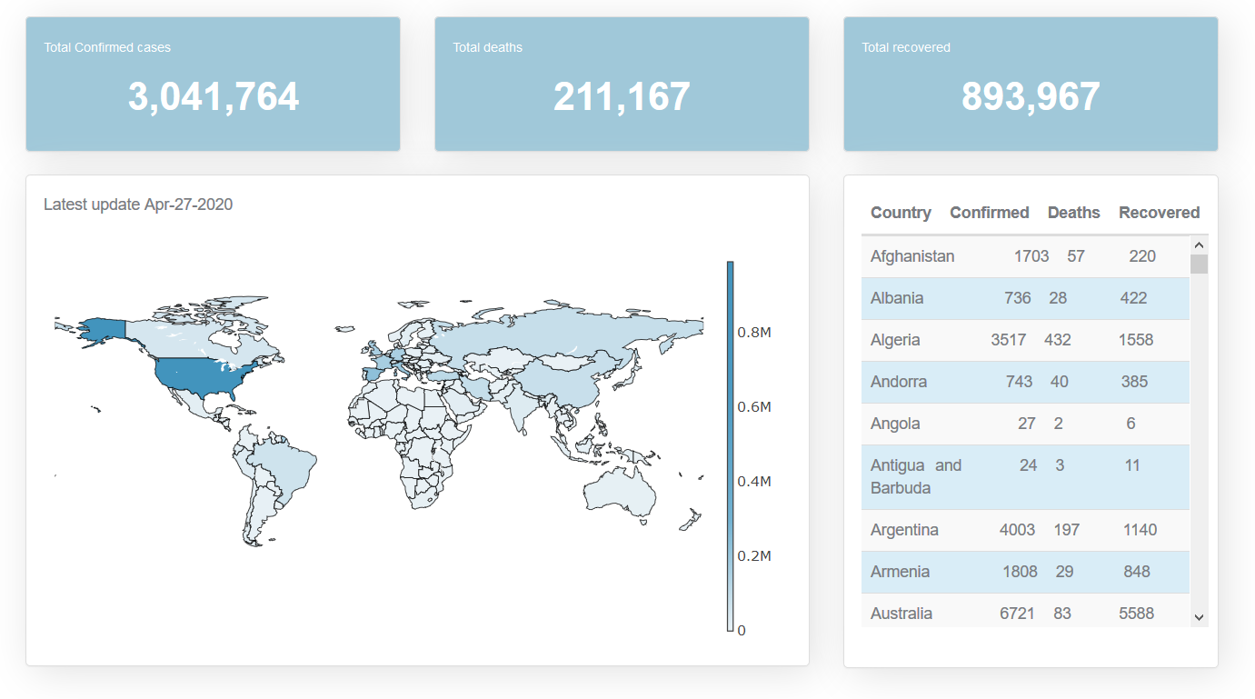
The COVID-19 Dashboard shows the breathtaking speed and reach of COVID-19. On Jan. 27, there were 2,886 confirmed cases. As of now, there are over 3 million confirmed coronavirus cases worldwide with over 211K total deaths.

The best dashboard for coronavirus COVID-19
Our COVID-19 Dashboard was built in a manner which gives you a real-time picture of world coronavirus updates about the total number of deaths, recoveries, and new cases reported in a single glance.
COVID-19 dashboard displays the number and location of confirmed cases as they are reported, as well as the total number of deaths and recoveries. You can zoom in on specific locations and scroll to different regions. And on the table, you’ll see information on the number of cases by country. The COVID-19 dashboard is responsive that means it adapts to any device you use. You can access COVID-19 dashboards from anywhere, any time, on standard browsers using any internet-enabled device such as PC, tablet, or mobile phone.
Real-time COVID-19 data for Dashboard in a single click
Our COVID-19 dashboard uses data for visualization was provided by The data that was used for all visualizations was provided by the Johns Hopkins University Center for Systems Science and Engineering (JHU CSSE) who shared their data on a public. The Johns Hopkins CSSE aggregates data from primary sources, such as the World Health Organisation, national, and regional public health institutions. This data is made freely available and is updated every day.
High-Tech Technology used in COVID-19 dashboard
The COVID-19 Dashboard is built in PHP, Javascript, HTML5 and D3.js library. The dashboard has a beautiful web interface, drag and drop tool using the most powerful JavaScript Library, this powerful drag, and drop tool helps you to create your dashboard without writing a single line of code.
Our dashboard tool supports a variety of different charts that include but not limited to a line chart, scatter chart, bar chart, pie chart, donuts chart, bubble chart, stack chart, area chart, heatmap chart, Sankey diagram maker, and choropleth map, etc. All these are D3.js based dynamic SVG charts. Not only this. The dashboard tool can be used to create either static or real-time database-driven dashboards with data coming from a variety of sources such as MySQL, MS SQL, SQLite, PostgreSQL, Sybase and Cubrid with no programming required and also to import data from MS Excel and CSV files.