Pareto Chart overview
A Pareto Chart is a graph that indicates the frequency of defects, as well as their cumulative impact. Pareto Charts are useful to find the defects to prioritize in order to observe the greatest overall improvement.
Pareto Chart background
In 1906, Vilfredo Pareto an Italian social scientist, discovered that roughly 20% of the population owned 80% of the wealth. From there, he noticed that these proportions described many other aspects of society. This led him to propose the 80-20 rule.
In 1940, Dr. Joseph Juran prominent in the field of operations management, applied the 80-20 rule to quality control for business production. He demonstrated that 80 percent of problems are due to 20 percent of the root causes. By focusing on and reducing the 20% of production problems, a business could increase its overall quality.
A Pareto Chart or Pareto Diagram named in the honor of Vilfredo Pareto, is a type of histogram, which arranges the result from most frequent to least frequent to help identify which root causing are resulting in the most problem.
In order to expand on this definition, let’s break a Pareto Chart into its components.
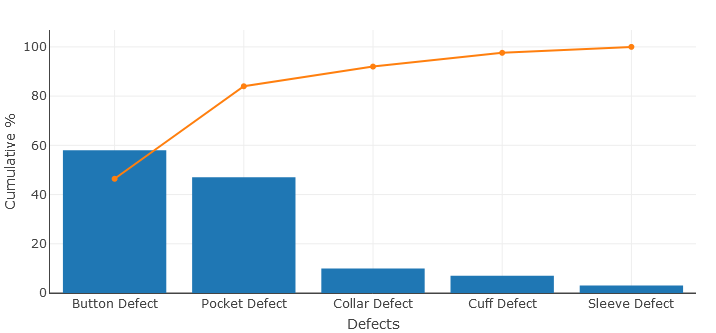
A Pareto Chart is a combination of a bar graph and a line graph. Each bar usually represents a type of defect or problem. The bars are presented in descending order from highest to shortest. So that, which defects are more frequent, can be seen at a glance. The height of the bar represents any important unit of measure and often presents the frequency of occurrence or cost. The line represents the cumulative percentage of defects.
Create your Pareto Chart
Just take a look at the following table of data to understand what cumulative percentage is.
| Type of Defect | Frequency of Defect | Cum. Frequency | Cumulative % |
|---|---|---|---|
| Button Defect | 58 | 58 | 46.4 |
| Pocket Defect | 47 | 105 | 84 |
| Collar Defect | 10 | 115 | 92 |
| Cuff Defect | 7 | 122 | 97.6 |
| Sleeve Defect | 3 | 125 | 100 |
Cumulative percentages indicate what percentage of all defects can be removed if the most important types of defects are solved.
In the example above, the CumFrequency% for Button Defect is simply (58/125)*100. The last cumulative percentage will always be 100% that is solving just the two most important types of defects — Button Defects and Pocket Defects (58+47 = 105 – will remove 84% of all defects.
In any Pareto Chart, for as long as the cumulative percentage line is steep, the types of defects have a significant cumulative effect. Therefore, it is worth fi1nding the cause of these types of defects and solving them. When the cumulative percentage line starts to flatten, the types of defects do not deserve as much attention, since solving them will not influence the outcome as much.
What is the Pareto Principle?
According to the Pareto Principle, 80% of the results are determined by 20% of the causes. Therefore, it is obvious to find 20% of defect types that are causing 80% of all defects. Although the 80/20 rule does not apply perfectly to the example above, focusing on just 2 types of defects (Button and Pocket) has the potential to remove the majority of all defects (66%).
How to create Pareto Chart in PHP
Now, we have a fair understanding of what the Pareto Chart is. When comes time to build Pareto Charts to analyze defects in your production lines, you should not have to open Excel or any other tool. The Dashboard Builder will create your Pareto Chart in PHP automatically in a few clicks.
CREATE TABLE pareto_pareto (
          Id INTEGER PRIMARY KEY,
          Defects TEXT NOT NULL,
          Frequency INTEGER
);
To insert data into a pareto table, you use the INSERT statement. SQLite provides various forms of the INSERT statements that allow you to insert a single row, multiple rows, and default values into a table. In the following example, we will be inserting our data into pareto table using multiple rows.
INSERT INTO pareto_pareto (Id, Defects, Frequency)
VALUES
          (1, "Button Defect", 58),
          (2, "Pocket Defect", 47),
          (3, "Collar Defect", 10),
          (4, "Cuff Defect", 7),
          (5, "Sleeve Defect", 3);
Now, use the following SQL statement to show the result
select * from pareto_pareto;
| Id | Defects | Frequency |
|---|---|---|
| 1 | Button Defect | 58 |
| 2 | Pocket Defect | 47 |
| 3 | Collar Defect | 10 |
| 4 | Cuff Defect | 7 |
| 5 | Sleeve Defect | 3 |
An example of pareto database in SQLite has been uploaded and available for downloading at this location.
STEP-1: Launch the Dashboard Builder application
Installation
- Download from https://dashboardbuilder.net/download-free-dashboard
- Place the files in a directory on the web server. e.g. …/www/dashboar/dbuilder/
- Unzip the file using Extract Here option to the root folder of "dashboardbuilder"
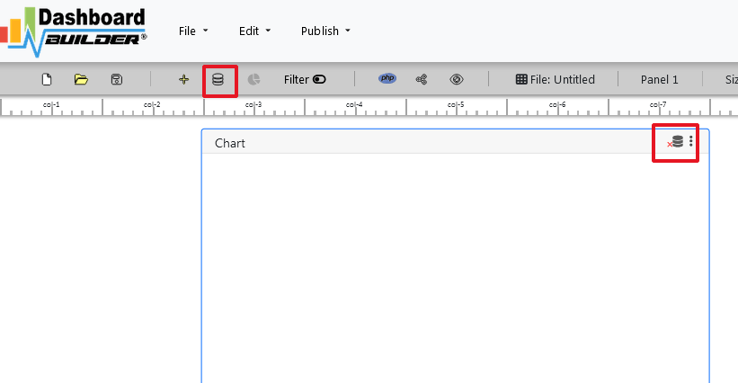
- Type the URL http://localhost/dashboardbuilder in your browser address bar to run dashboard builder. Following welcome screen will appear.
STEP-2: Connect with your database
On the above screen, click the Database icon following screen will appear:
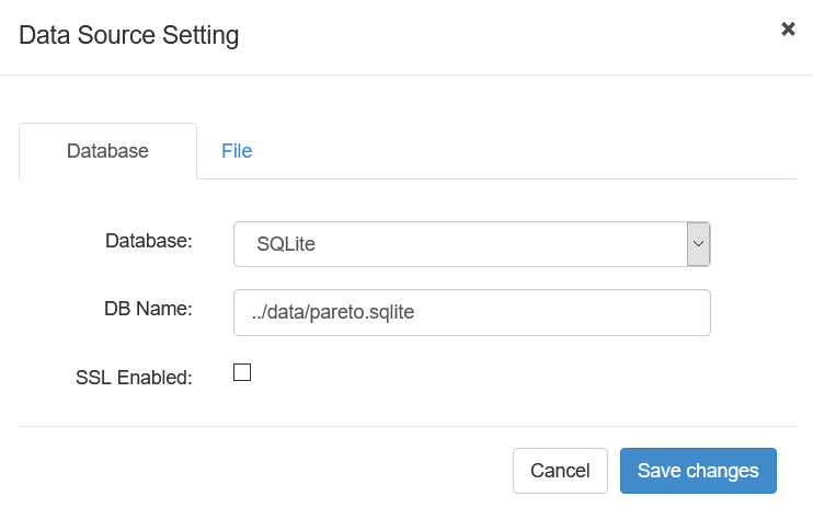
In the above screen, select SQLite from the dropdown of Database list.
Enter your database, in this example we have copied the database in the data folder, so our database path is ../data/pareto.sqlite.
Now save the changes by clicking the “Save changes” button.
STEP-3: Retrieve data from your database
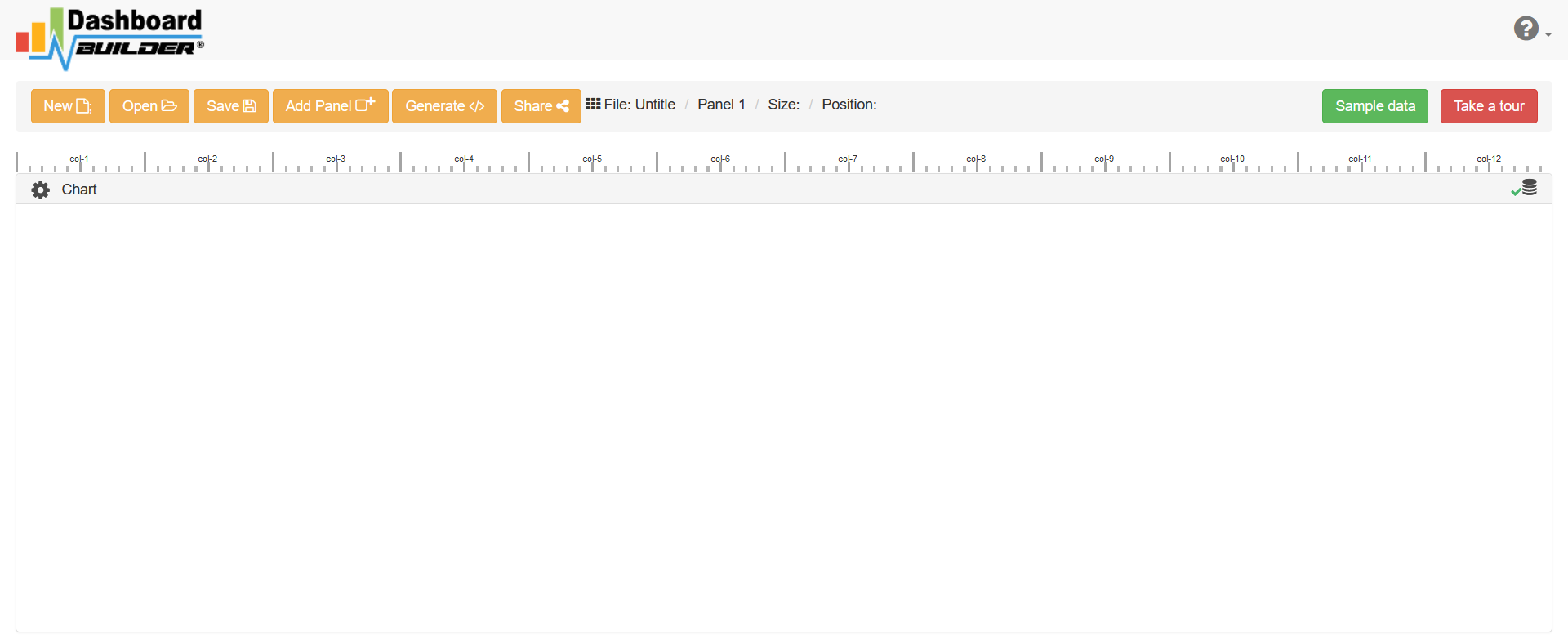
In the above screen, click the chart gear icon to open the chart designing tool. Now, insert the following query in the SQL editor box.
select A.Id, A.Defects, A.Frequency, SUM(B.Frequency)
as CumFrequency, SUM(B.Frequency)/(select SUM(Frequency)
from pareto_pareto)*100 as CumFrequencyPerc
from pareto_pareto A, pareto_pareto B
where A.Id>= B.Id group by A.Id, A.Frequency;
Now, hit the “Run Query” button.The following result will be generated:

STEP-4: Create Pareto Chart
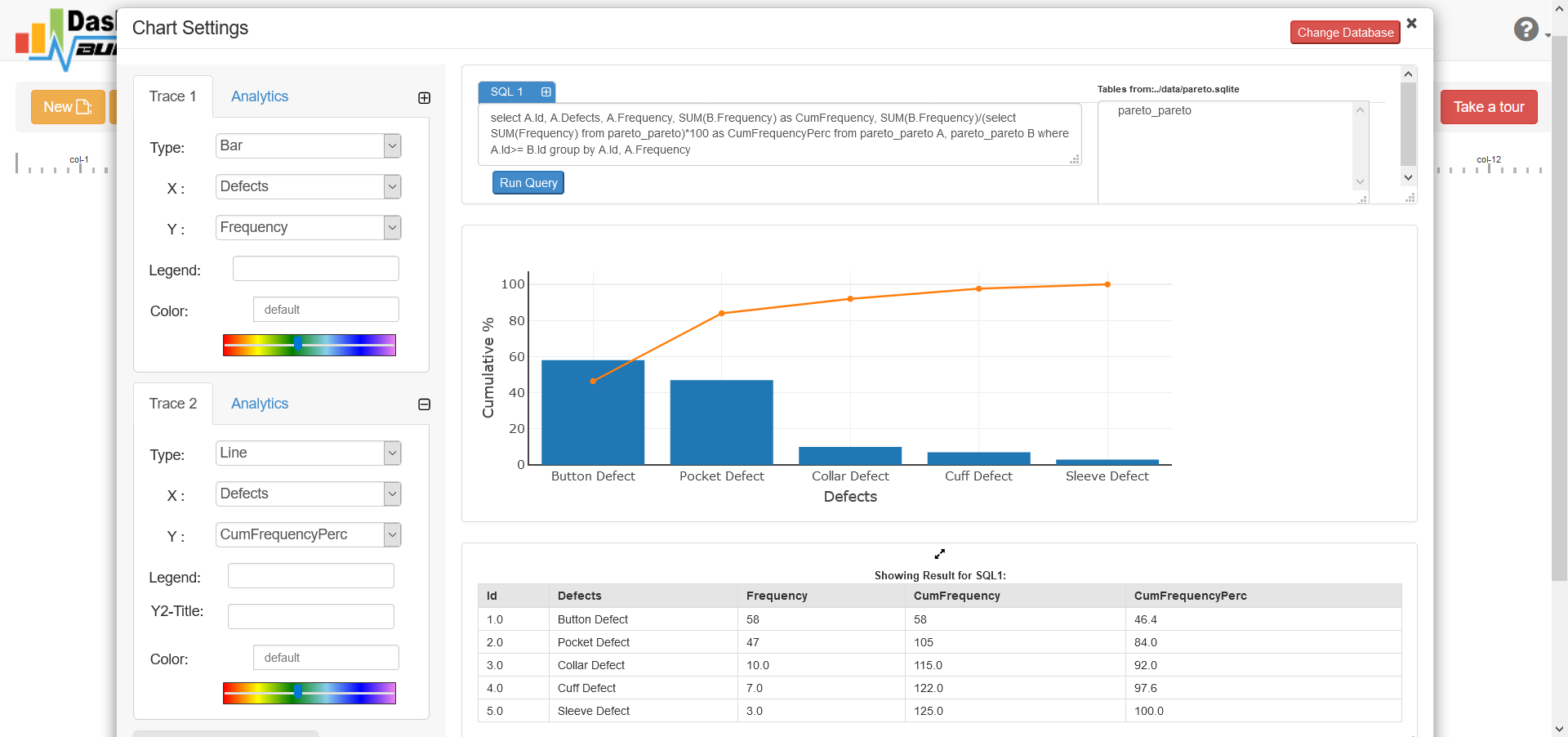
In this example, we will be using to trace, one is for bar chart and which will show the defect and other is line chart which will show the cumulative sum of the frequency.
Now, select Bar from the drop down list of chart type.
Select Defects for X axis and Frequency for Y axis
Our bar chart will show something like this
STEP-5: Save and Share your Pareto Chart
There is several ways you can share your dashboard such as
- Save as PNG by clicking the camera button and send via email attached or upload to any share drive.
- If you are using a public host then you can share your chart just clicking the share but, it will give you a share link for accessing your chart.
- Click the Generate button to generate PHP source code, you will get a window open with the PHP source code of your chart. This PHP code can be integrated your dashboard into any web application written in PHP or any PHP frameworks like Wordpress, Laravel, CodeIgniter, Joomla and others.
Click here to download complete project