Advanced Dashboard Filtering with Rich Filter Controller – Download FREE
How to create effective data visualizations and discover insights to help you achieve business goals with an Interactive Rich Filter Controller
Data visualization is a powerful way to help people understand complex data. With the right tools and techniques, you can create engaging and informative visualizations that reveal insights and patterns in your data. One way to improve your data visualization is by using a rich filter controller. In this article, we'll explain what a rich filter controller is and how it can improve your data visualization.
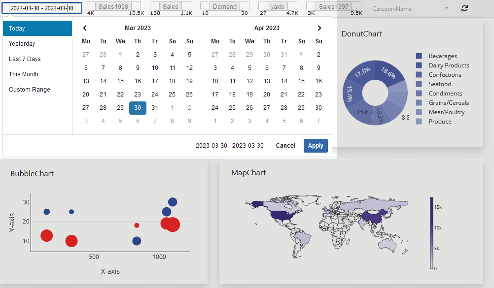
Advanced Dashboard Filtering Overview:
Advanced filtering options in a dashboard are powerful tools for users to interact with and better understand their data in a dashboard. Multi-select filtering, search filtering, dynamic filtering, conditional filtering, and sorting are just a few of the advanced filtering options available in a dashboard. By using these advanced filtering options, users can more easily filter and explore their data, uncover insights, and make more informed decisions.
Assumption: Dashboard Builder 6.1 or higher version is already installed
What Is Advanced Dashboard Filtering?
Advanced Dashboard Filtering is a powerful way to interact with data by allowing users to dynamically refine, segment, and explore dashboard insights in real time. Unlike basic filters that apply simple, static conditions, advanced filtering supports multi-select options, dynamic parameters, date and range controls, and cross-dashboard filtering. This enables users to instantly adjust views, uncover patterns, and analyze specific scenarios without reloading data or creating multiple dashboards. Advanced dashboard filtering is especially valuable for analytics-driven teams that need fast, flexible, and user-controlled data exploration.
1. Multi-Select Filtering
Multi-select filtering is a useful advanced filtering option that allows users to select multiple values for a single filter. For example, in a sales dashboard, users might want to filter sales data by multiple product categories or regions. With multi-select filtering, users can select multiple values from a dropdown list, allowing them to see data for all selected values at once.
2. Search Filtering
Search filtering is a powerful way to filter data quickly and efficiently. With search filtering, users can search for specific values within a larger dataset. For example, in a customer database, users might want to search for customers who live in a specific city or state. Search filtering allows users to enter a search term and quickly find the relevant data.
3. Dynamic Filtering
Dynamic filtering is a powerful way to filter data based on user interactions with a dashboard. With dynamic filtering, users can interact with a visualization, and the data displayed will automatically adjust to reflect the user's selections. For example, in a map visualization, users might want to filter data by clicking on a specific region or state. With dynamic filtering, the data displayed will automatically update to show only the data relevant to the selected region.
4. Conditional Filtering
Conditional filtering is an advanced filtering option that allows users to filter data based on specific conditions. For example, in a sales dashboard, users might want to filter data to show only sales data for a specific date range and a specific product category. With conditional filtering, users can specify the conditions for filtering the data, and the data displayed will automatically adjust to reflect those conditions.
5. Sorting
Sorting is a powerful advanced filtering option that allows users to sort data in ascending or descending order based on a specific attribute. For example, in a customer database, users might want to sort data by customer age, last name, or location. Sorting allows users to quickly identify patterns and trends in their data and to see the most relevant data first.
How Advanced Filtering Improves Dashboard Performance
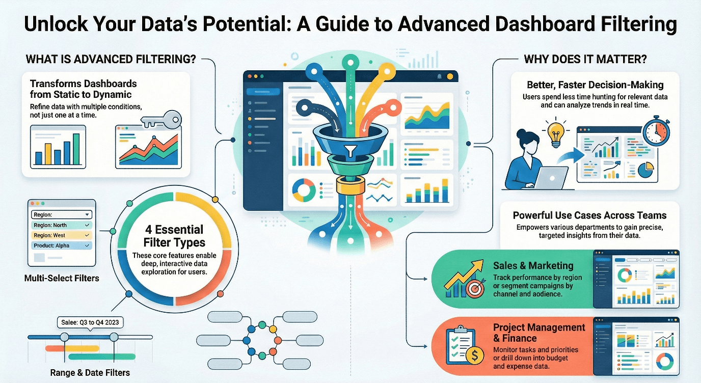
Advanced filtering improves dashboard performance by reducing the amount of data processed and displayed at any given time. When users apply dynamic, range-based, or multi-select filters, the dashboard focuses only on the relevant data subset instead of loading entire datasets. This results in faster load times, smoother interactions, and a more responsive user experience, especially when working with large or real-time data sources..
Beyond speed, advanced filtering also improves analytical performance. Users can drill down into specific segments, compare scenarios, and identify trends without switching dashboards or running separate queries. This reduces cognitive load, keeps insights in one place, and helps teams make faster, more confident decisions based on accurate and targeted data views.
What is a rich filter controller?
A rich filter controller is a tool that allows users to interact with a data visualization by selecting specific criteria to filter the data. For example, a rich filter controller might allow users to select a date range or filter data by specific categories such as product types or geographic regions. Rich filter controllers are called "rich" because they offer a wide range of filtering options beyond basic filtering features, such as filtering by date, numbers or category. Rich filter controllers often offer advanced filtering options such as multi-select, search, or sorting.
How can a rich filter controller improve your data visualization?
- Increased interactivity A rich filter controller allows users to interact with your data visualization in a more meaningful way. Instead of passively viewing a static visualization, users can explore the data and filter it in ways that are relevant to their needs. This increased interactivity can lead to a more engaging and informative experience.
- Better insights By using a rich filter controller, users can explore your data visualization in more detail and uncover insights that might not be immediately apparent. For example, users might filter the data to show only a specific product type or date range, revealing patterns or trends that might be missed in a broader view of the data.
- Improved usability A rich filter controller can improve the usability of your data visualization by making it more intuitive and easier to use. By providing a range of filtering options, users can quickly and easily find the data they need, without having to navigate through complex menus or interfaces.
- Enhanced aesthetics Rich filter controllers can also enhance the aesthetics of your data visualization. By offering advanced filtering options, you can create a more visually appealing and interactive experience for users. For example, you might use icons or images to represent different filter options, or use animations to show how the data changes when a filter is applied.
Platforms That Support Advanced Dashboard Filtering
Several modern analytics and dashboard platforms support advanced dashboard filtering, allowing users to interact with data beyond basic static views. Business intelligence tools like Tableau and Power BI offer advanced filtering through parameters, slicers, and interactive controls that enable users to dynamically adjust data views and explore trends in real time. These platforms are commonly used for enterprise reporting and performance analysis where flexible data exploration is essential.
Project and operational tools such as Jira also provide advanced filtering capabilities through rich filters and controllers, primarily focused on issue tracking and project dashboards. While these features are effective within their specific ecosystems, platform-agnostic solutions that offer advanced dashboard filtering across multiple data sources provide greater flexibility, scalability, and consistency for organizations that rely on diverse datasets and real-time analytics.
| Feature | Traditional Filters | Advanced Dashboard Filtering |
|---|---|---|
| Multi-select | Limited | Yes |
| Dynamic updates | No | Yes |
| Cross-dashboard sync | No | Yes |
| User-level control | Limited | Advanced |
Advanced Dashboard Filtering vs Jira Rich Filters
Unlike Jira-specific rich filters, which are primarily designed for project tracking within the Jira ecosystem, platform-agnostic advanced dashboard filtering works across multiple data sources and dashboards. While Jira filters are useful for managing issues and projects, they are limited when it comes to multi-select options, dynamic parameters, and cross-dashboard analysis.
Platform-agnostic advanced dashboard filtering provides flexible, real-time control over data, allowing users to drill down, segment, and explore insights across different systems without being tied to a single platform. This makes it ideal for business intelligence, analytics, and executive dashboards where fast, interactive, and comprehensive data exploration is critical.
| Feature | Jira Rich Filters | Advanced Dashboard Filtering |
|---|---|---|
| Multi-select filtering | Limited | Yes |
| Dynamic parameter support | Limited | Yes |
| Cross-dashboard control | No | Yes |
| Platform flexibility | Jira only | Any BI/dashboard platform |
| Real-time data exploration | Partial | Full support |
Creating Dynamic Dashboards and Data Analysis with Interactive Rich Filter Controller
Creating dynamic dashboards with an interactive filter controller can greatly enhance the user experience and help users gain insights from their data. In this article, we will walk you through the process of creating dynamic dashboards with an interactive filter controller using various tools.
- Step 1: Choose your data source The first step in creating a dynamic dashboard is choosing your data source. You can use a wide range of data sources, including Excel spreadsheets, CSV files, Google Sheets, JSON or even a database. The choice of your data source depends on the size and complexity of your data.
- Step 2: Connect your data source to your visualization tool Once you have chosen your data source and visualization tool, the next step is to connect your data source to your visualization tool. Depending on your choice of tools, this process may differ slightly, but typically, you will need to follow the prompts to connect your data source to your visualization tool.
- Step 3: Design your dashboard Now that you have connected your data source to your visualization tool, it's time to design your dashboard. In this step, you can choose the visualizations you want to use and customize them to suit your needs. Some popular types of visualizations include charts, graphs, tables, and maps.
- Step 4: Add an interactive filter controller The next step is to add an interactive filter controller to your dashboard. An interactive filter controller allows users to filter the data displayed on the dashboard based on specific criteria, such as date ranges or product categories. Depending on your choice of visualization tool, this process may differ, but typically, you will need to follow the prompts to add an interactive filter controller to your dashboard.
- Step 5: Customize your interactive filter controller Now that you have added an interactive filter controller, you can customize it to suit your needs. Depending on your choice of visualization tool, this may involve selecting the type of filter you want to use and specifying the criteria for filtering the data.
- Step 6: Test and refine your dashboard Once you have designed your dashboard and added an interactive filter controller, it's time to test it and refine it based on user feedback. You may need to make tweaks to your visualizations or your interactive filter controller to ensure that your dashboard provides the insights your users need.
How to create effective data visualizations with an Interactive Rich Filter Controller
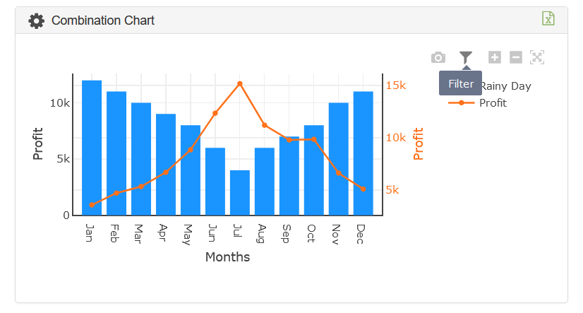
Follow the steps below to apply the filter and sort data option to a chart or dashboard.
Assumption: You have already created a chart and wanted to add a filter.
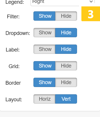
- Click the gear icon button.
- In the next screen extends the Properties.
- Click the Show Filter button. 3
- Click the save changes button.
How to use the sort data option in a chart
Note: You can sort either X or Y axis data at a time
How to use exchange X and Y data
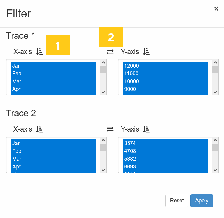
How to restore your original chart
- Click the filter button
- Click the Reset button
How to add filter to a dashboard
Follow the steps below to apply a filter to the dashboard.
Assumption: You have already created a chart and added a filter.
- Click the Filter button. 1
- A Rich Filter Controlle 2 automatically appears.

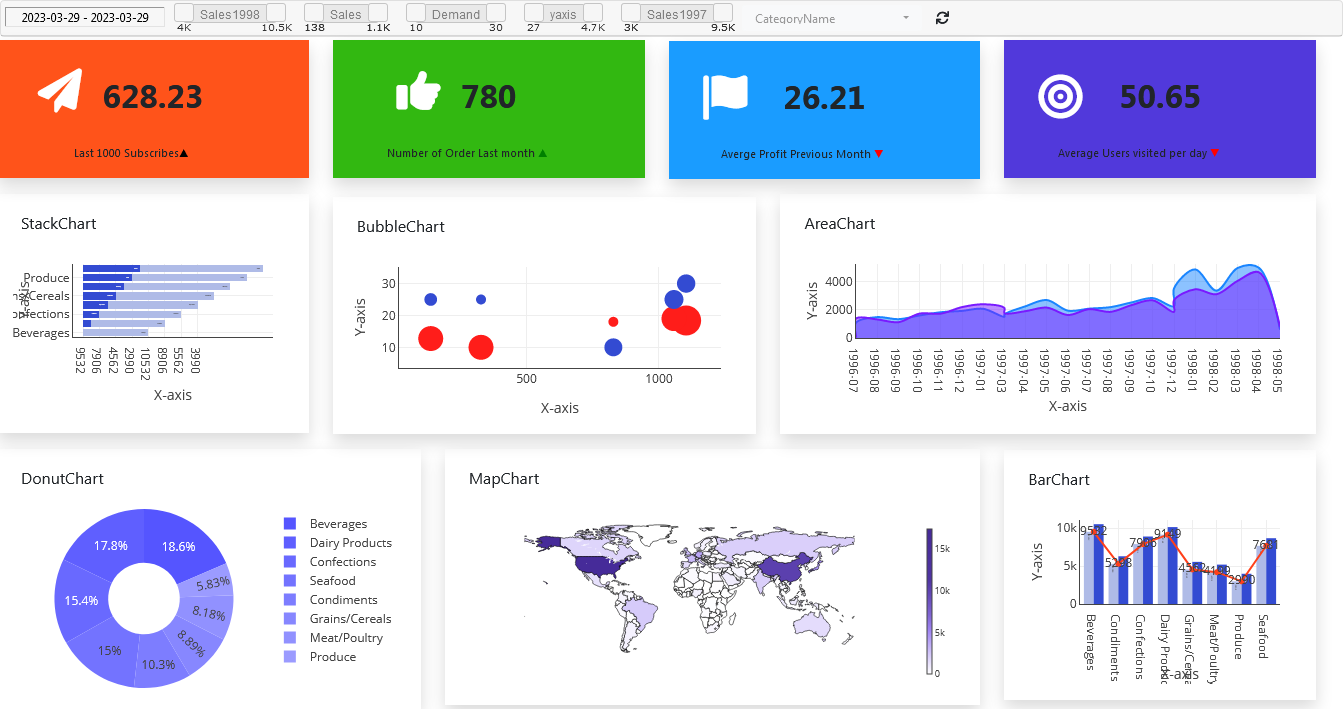
A Dashboard with Rich Filter Controller
Frequently Asked Questions
How helpful was this information?
Related topics
- Advanced Dashboard Filtering with Rich Filter Controller – Download FREE
- How to create effective data visualizations and discover insights to help you achieve business goals with an Interactive Rich Filter Controller
- Advanced Dashboard Filtering Overview:
- What Is Advanced Dashboard Filtering?
- How Advanced Filtering Improves Dashboard Performance
- What is a rich filter controller?
- How can a rich filter controller improve your data visualization?
- Platforms That Support Advanced Dashboard Filtering
- Advanced Dashboard Filtering vs Jira Rich Filters
- Creating Dynamic Dashboards and Data Analysis with Interactive Rich Filter Controller
- How to create effective data visualizations with an Interactive Rich Filter Controller
- How to use the sort data option in a chart
- How to use exchange X and Y data
- How to restore your original chart
- How to add filter to a dashboard
- A Dashboard with Rich Filter Controller
- Video tutorial on how to apply filter to a chart or dashboard with Dashboard Builder®
- Frequently Asked Questions
- How helpful was this information?