3 simple expert techniques to create a real KPI chart in minutes
The real KPI chart is one of the most important tools in any business. The real KPI chart provides a clear visual representation of key performance indicators (KPIs) and help managers identify areas where they can improve their operations. KPI charts allow businesses to measure progress and performance, set goals, and make informed decisions. They are also great for tracking trends over time and comparing performance across different departments or divisions.
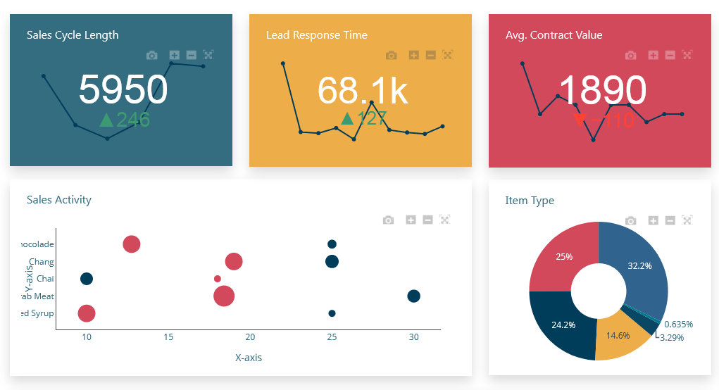
Real KPI Chart Overview
A KPI chart is an essential tool for any business looking to measure their performance. It provides a visual representation of key performance indicators (KPIs) that can be used to track progress over time and make informed decisions. This article will provide an example of a KPI chart, as well as discuss its various uses in the workplace. Additionally, it will explain how these charts can be used to determine if goals are being met, and how they can be used to motivate employees and teams. Finally, it will discuss the importance of selecting the right KPIs for your business and how best to interpret the data provided by a KPI chart.
Assumption: Dashboard Builder 6.0 or higher version is already installed
What is a KPI Chart?
The KPI charts are a great way to visualize performance metrics and track progress against goals. By using KPI charts, businesses can quickly and easily measure their performance against key metrics such as customer satisfaction, employee engagement, and revenue growth.
A company or organization's current performance can be seen at a glance using the KPI (Key Performance Indicators) chart. KP charts are used to measure and present factors that are essential for assessing how the business is performing. There are different kinds of information displayed. Information on net revenue, sales growth, and customer satisfaction are a few examples of KPIs.
The KPI chart is made up of a grid of tiles, each of which shows different KPI values for a specific category. Additionally, a sparkline, a straightforward line graph, can be added to show the performance over time. A tile background's color can also be used to convey performance.The values displayed within a tile may also be derived from data from various data tables.
The KPI chart information is described below:

Performance can be represented in the KPI chart in a variety of ways:
- Display a primary value that reflects the most recent calculation of the factor
- Display the comparative value that will be used to compare and/or evaluate the primary value.
- Comparisons of the actual value to a target value or to a corresponding value for a different time period are examples of evaluations.
- A sparkline that displays the main value over time will be displayed.
- Use the performance indicator's colors to indicate the performance level right now. for instance, the green color represents according or ahead to the plan whereas the red color represents behind to the plan. It also includes threshold values that the current primary value is compared to. The colors of the indicator is altered based on the evaluations' findings.
KPI Chart benefit
KPI charts are a great way to track and measure the performance of your business. They provide an easy-to-understand visual representation of key performance indicators (KPIs) that can help you make informed decisions. With KPI charts, you can quickly identify areas of improvement, allocate resources more effectively, and evaluate the success of your strategies. KPI charts also provide insights into customer behavior, allowing you to make better decisions about product development and marketing campaigns. As such, they are a powerful tool for businesses looking to take their performance to the next level.
The fasted way to create a KPI chart using the Best Practices
APPLIES TO: On-premises Online Desktop
Requirements
The Dashboard Builder can be installed any platforms like Windows, Linux, Mac and Ubuntu or any other platforms support Apache.
- PHP Version 7.2 or later
- Apache 2 or later
- Windows 7 or later /Linux 3 or later
- Firefox 52, Chrome 57, IE 8
Installation
- Download from https://dashboardbuilder.net/download-free-dashboard
- Place the files in a directory on the web server. e.g. …/www/dashboar/dbuilder/
- Unzip the file using Extract Here option to the root folder of "dashboardbuilder"
STEP-1: Launch the Dashboard Builder application
- Access the web folder in your browser. e.g. http://localhost/dashboardbuilder following welcome screen will appear.
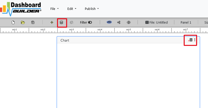
- Now Click the Database icon
- The next screen is displayed. Select a database on the Data Sources tab. Select MySQL.
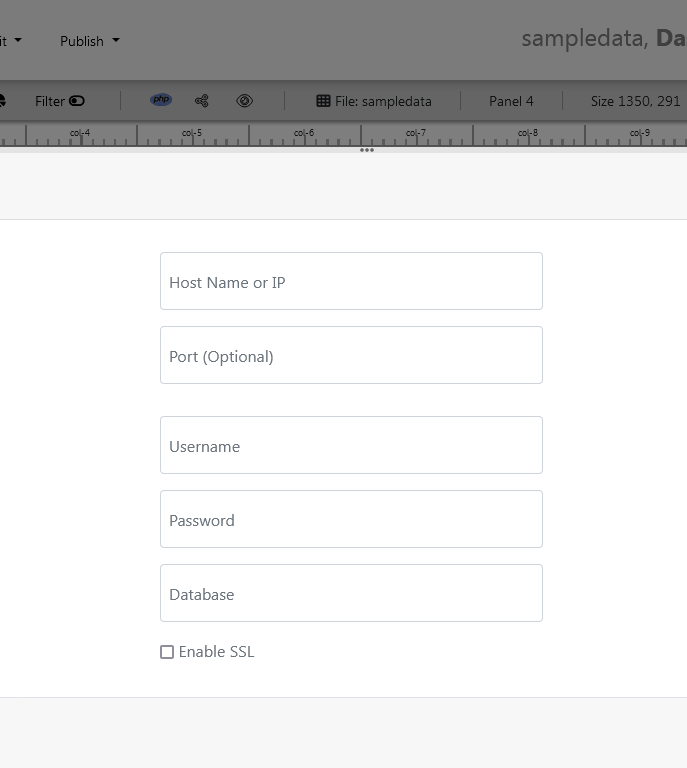
- In the next screen, Enter your database credentials. and follow the on-screen instructions to save the changes.
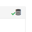
- When you click the Save changes , A green tick mark with a database appears, indicating that your database has been successfully connected.
STEP-2: Access the data
- In the next step we will retrieve the data from the database we just connected. Select the gear icon to the chart preferences.
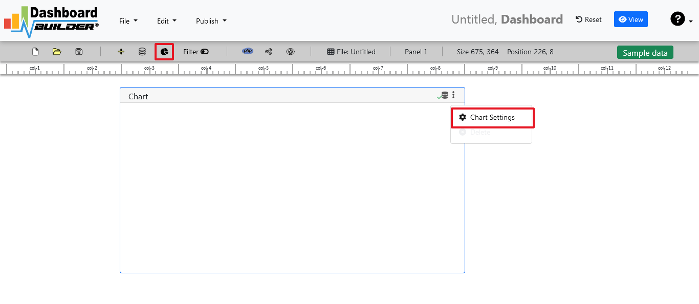
- In the next screen a list of tables is displayed.
STEP-3: Assign data
- As shown in the image below, a pop-up screen and a list of the tables will appear on the table list:

The Dashboard Builder for KPI chart includes a powerful Query Builder and a smart SQL statement builder tool for quick and easy writing of complex SQL queries without the need for manual code writing, which is intended to simplify data retrieval from the database.
- When you click on a table, a default SQL statement appears in the SQL statement box, which you can modify as needed.
- You can use up to ten SQL statements at the same time to get data from various tables.
- In this example, we'll make a simple KPI chart for your dashboard.The dashboard builder will include a KPI chart where customers can see sales statistics and keep product info.
- Now, type the following SQL query in the text field in the format shown below.
SELECT strftime('%Y-%m',o.shippeddate) as xaxis, sum(d.quantity) as yaxis
from `order details` d, orders o
where o.orderid = d.orderid group by strftime('%Y-%m',o.orderdate)
- Now we'll run our query and retrieve the data from the tables. Hit the Run Query button to execute the SQL query.

STEP-4: Select KPI Chart
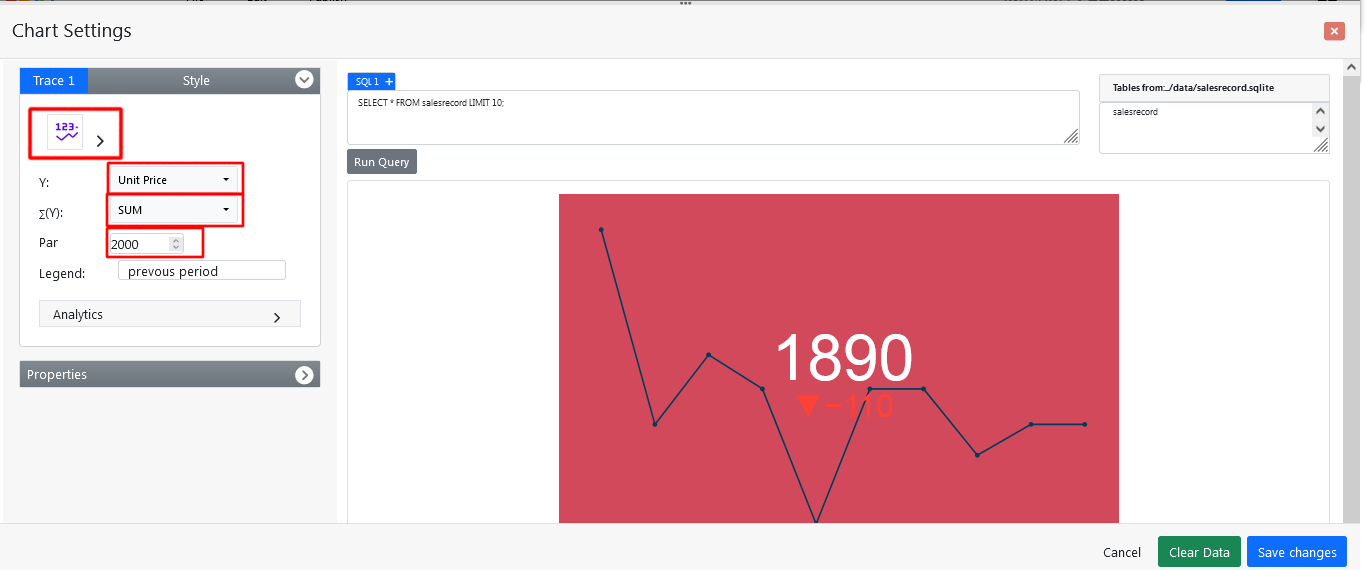
- The query result will retrieve the data and display on the panel. Now select the KPI chart from the drop down list of the chart type.
- Choose your y-axis data from the Y drop down list
- Select your desire formula from the drop download list e.g Sum, Avg, Count, Max, Min, Var, Std
- Enter your Par or Target Value
- Click the Save Changes button
All set!!!
- As illustrated below, charts will appear on the screen.
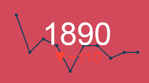
KPI Chart Dashboard Example
Whether you're looking for inspiration or just want to take a quick look at your clients, a pre-made sample page can get your project started. Creating dashboards using the real KPI chart has never been easier.
Conclusion
You've learned how to create a real KPI chart in your project, create new charts and graphs, and customize the look and feel using the dashboard builder. Before we go, we'd like to introduce you to the premium version of Dashboard Builder, which has many features compared to the free version.
How helpful was this information?
- 3 simple expert techniques to create a real KPI chart in minutes
- STEP-1: Launch the Dashboard Builder application
- STEP-2: Access the data
- STEP-3: Assign data
- STEP-4: Select KPI Chart
- KPI Chart Dashboard Example
- Video tutorial on how to a real KPI chart with Dashboard Builder®
- Conclusion
- How helpful was this information?