Card Visualization: The Tile Visualization or Large Number Tiles
Unlock valuable insights with card visualizations, also known as Large Number tiles or sample called Tile Visualization. Learn how to create and customize these visualizations using the Dashboard Builder. Discover the benefits and step-by-step guide for effective data communication and decision-making
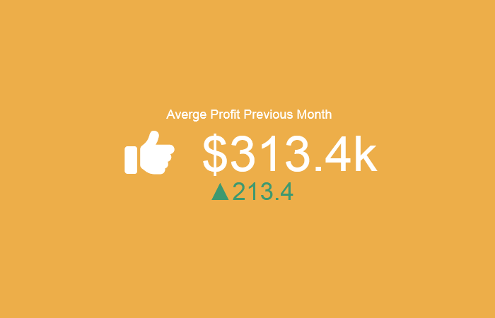
Harnessing the Power of Card visualizations (Large Number Tiles) for Data Insights
Card visualizations, often referred to as Large Number tiles, are instrumental in conveying key metrics succinctly. In this article, we'll explore the significance of card visualizations, their role in data interpretation, and how to leverage them effectively using the Dashboard Builder.
Assumption: Dashboard Builder 7.1 or higher version is already installed
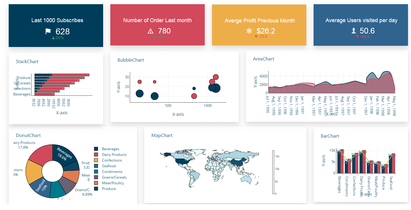
Benefits of Card Visualizations
The benefits of card visualizations are manifold:
- Simplicity: With a focus on a single number, card visualizations simplify complex data sets, enabling quick comprehension.
- Clarity: By presenting key metrics prominently, card visualizations eliminate ambiguity and facilitate clearer decision-making.
- Efficiency: The succinct nature of card visualizations allows users to monitor critical KPIs efficiently, saving time and effort.
- Versatility: Card visualizations are versatile tools suitable for various industries and use cases, from finance to marketing and beyond.
Understanding Card Visualizations
Card visualizations, also known as Large Number tiles, provide a concise representation of essential metrics. They offer a single number view, making it easy to grasp critical insights at a glance. Whether tracking total sales, market share year over year, or total opportunities, card visualizations excel in highlighting key performance indicators (KPIs) with precision.
Within a card visualization, several elements work together to convey essential information effectively. From the primary value representing the core metric to the sparkline illustrating trends over time, each element plays a crucial role in communicating insights and guiding decision-making processes. Let's explore in detail the key elements typically found in a card visualization and how they contribute to the effectiveness of data presentation and analysis

- Title: A descriptive title or label that provides context for the data being presented in the card visualization.
- Primary Value: The main numerical value representing the key metric or performance indicator. This value is typically displayed prominently in the center of the card.
- Prefix/Suffix: Optional text or symbols that can be added before or after the primary value to provide additional context or clarify the unit of measurement.
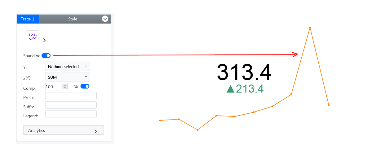
- Sparkline: A small line chart often displayed below or beside the primary value, showing the trend or change in the metric over a period of time.
- Performance Indicator: Color-coded indicators such as arrows, icons, or text labels that provide a quick visual cue about the performance status of the metric (e.g., up arrow for positive, down arrow for negative).
- Comparative Value: An additional numerical value or percentage displayed alongside the primary value, representing a comparison to a target, previous period, or another relevant benchmark.
- Interactive Elements: Optional interactive elements such as tooltips or drill-down functionality that allow users to explore additional details or insights related to the card visualization.
By incorporating these elements effectively, card visualizations can provide clear, concise, and actionable insights into key metrics and performance indicators.
The Fastest Way to Create Card Visualizations Using Best Practices
APPLIES TO: On-premises Online Desktop
Requirements
The Dashboard Builder can be installed any platforms like Windows, Linux, Mac and Ubuntu or any other platforms support Apache.
- Dashboard Builder 7.1 or higher version
- PHP Version 7.2 or later
- Apache 2 or later
- Windows 7 or later /Linux 3 or later
- Firefox 52, Chrome 57, IE 8
Installation
- Download from https://dashboardbuilder.net/download-free-dashboard
- Place the files in a directory on the web server. e.g. …/www/dashboar/dbuilder/
STEP-1: Launch the Dashboard Builder application
- Access the web folder in your browser. e.g. http://localhost/dashboardbuilder following welcome screen will appear.
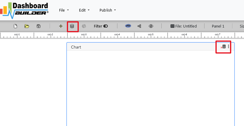
- Next, click on the Database icon, which will lead you to the next screen.
- Navigate to the Data Sources tab and select MySQL as your database..
- Proceed to enter your database credentials on the subsequent screen, following the on-screen instructions to save the changes.In the next screen,
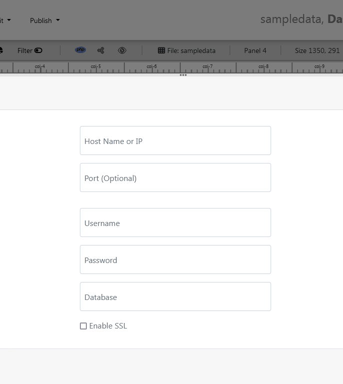
- Upon clicking the Save changes button, a green tick mark alongside the database icon confirms successful connection to your database.
STEP-2: Retrieve Data
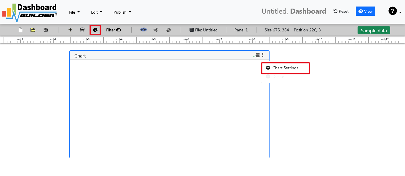
- In the following step, we'll access the data from the connected database. Click on the gear icon to access chart preferences..
- On the subsequent screen, you'll see a list of tables displayed..
STEP-3: Data Assignment
- In the subsequent stage, upon accessing the data, a pop-up screen will emerge alongside a list of available tables.:

The Dashboard Builder offers a robust Query Builder and an intelligent SQL statement builder tool, streamlining the creation of complex SQL queries without manual coding. This feature simplifies data retrieval from the database.
Upon selecting a table, a default SQL statement will populate the SQL statement box, which you can customize as necessary. You have the flexibility to employ up to ten SQL statements concurrently to extract data from various tables.
In this demonstration, we'll construct a basic Card Visualization for your dashboard. The Dashboard Builder will generate a Card Visualization enabling users to visualize sales statistics and product information.
Now, input the provided SQL query into the text field following the specified format:
SELECT strftime('%Y-%m',o.shippeddate) as xaxis, sum(d.quantity) as yaxis
from `order details` d, orders o
where o.orderid = d.orderid group by strftime('%Y-%m',o.orderdate)
- Next, execute the query to retrieve data from the tables by clicking the Run Query button.

STEP-4: Select KPI Chart
- Upon receiving the query results, they will be displayed on the panel. Now, proceed to select the KPI chart from the dropdown menu of available chart types.
- Choose your y-axis Y data from the dropdown list,
- Select your desired formula (e.g., Sum, Avg, Count, Max, Min, Var, Std), and input your Par or Target Value as necessary.
- Finally, click the Save Changes button to confirm your selections.
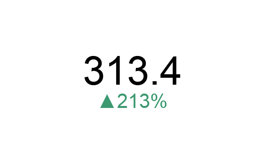
You're all set! The charts will now be visible on the screen.
Enable Sparkline in Card Visualization
What is a Sparkline in Card Visualization?
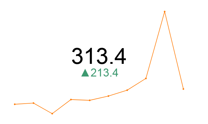
A sparkline is a small, simple chart, typically without axes or labels, embedded within a data visualization to give a quick view of trends or variations in data over time. In the context of card visualization, a sparkline can be used to show trends in key metrics directly within a summary card, providing at-a-glance insights without taking up much space.
How to Enable Sparkline in Card Visualization
- Enable the sparkline feature by clicking the sparkline button. This will automatically generate a small line chart based on the historical data of the selected metric.
Customize the Sparkline:
Adjust the settings for the sparkline to match your preferences. Common customization options include:
- Line Color: Choose a color under style tab that stands out and is consistent with your dashboard's color scheme.
- Time Range: Specify the time range in y-axis Y the sparkline should cover, such as the last 7 days, last month, or last year.
Additional Card Customizations:
Besides the sparkline, you can customize other aspects of the card:
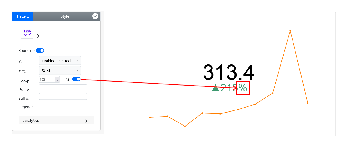
Change the comparative value to percentage
- Click the percentage toggle button to switch displayed comparative value from a number to a percentage
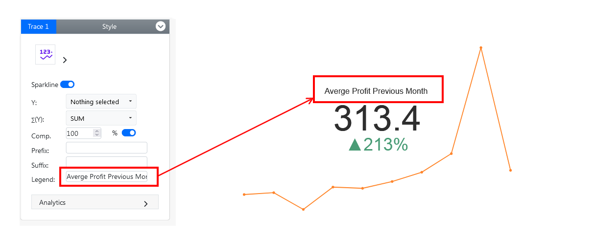
Add a clear and descriptive title to the card
- To add a descriptive title to the card, enter your text in the legend field.
- Font Size: You can customize the card's title font size under the Style tab to make it stand out and ensure it is consistent with your scheme
Adding a Suffix to the Primary Value
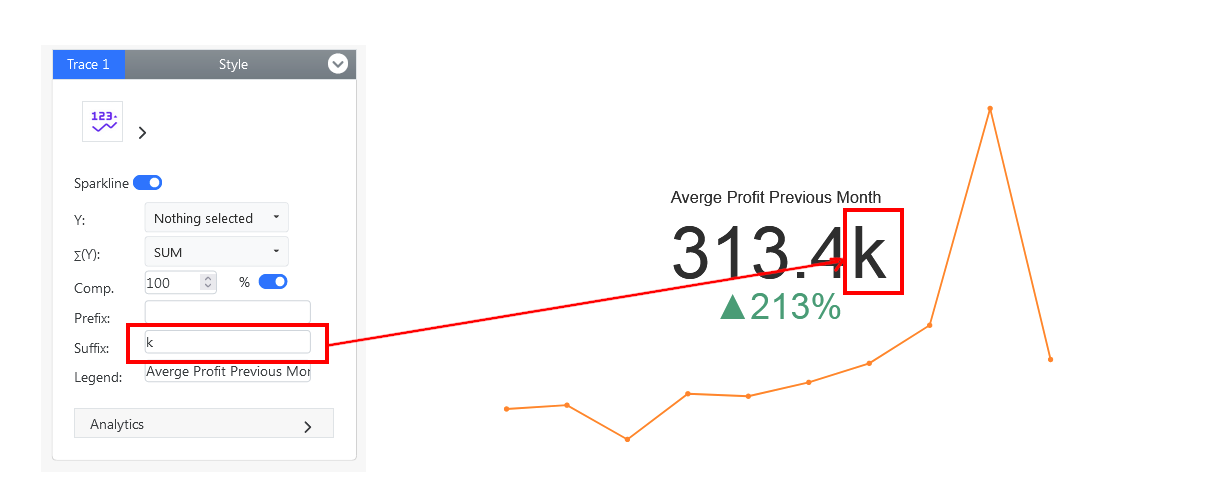
Adding a suffix like "K" for thousands or a percentage sign (%), to the primary value is important because it enhances readability and comprehension. These abbreviations help viewers quickly understand large numbers without having to interpret lengthy digits, making the card data more accessible and easier to digest. This simplification is especially useful in card visualization where space is limited, and clarity is crucial for effective communication.
- To append a suffix to the primary value of the card, simply input your desired text in the suffix field.
Adding a Prefix to the Primary Value
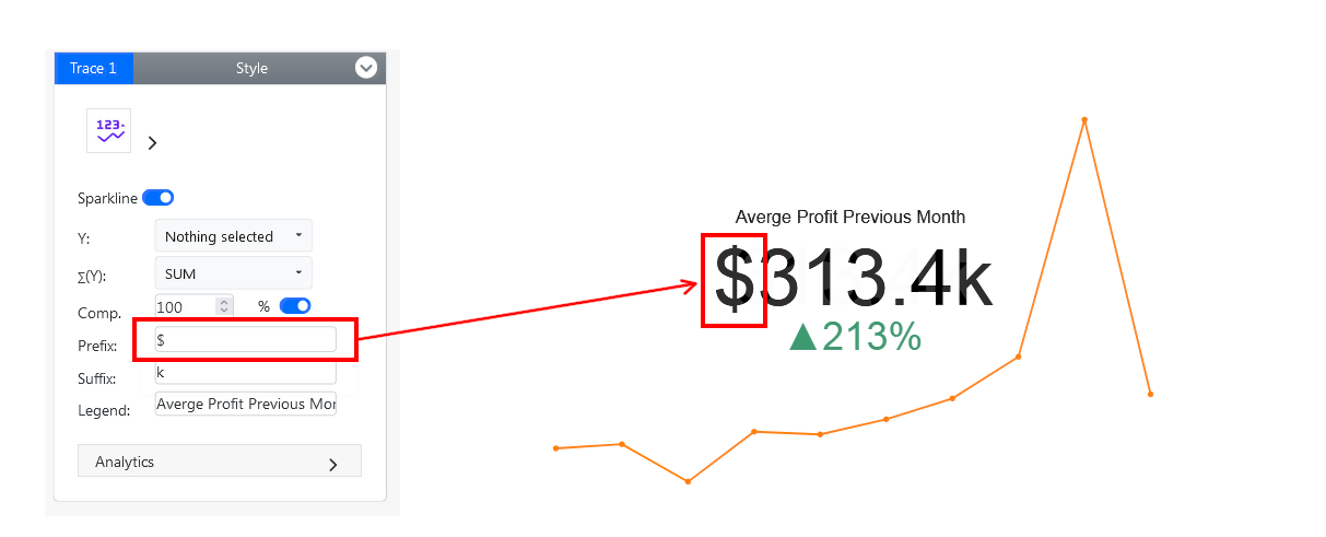
Adding a prefix to the primary value, such as a currency symbol ($) or the "#" symbol for numbers, is important because it provides immediate context about the nature of the data. Prefixes help users quickly identify what the numbers represent, whether it's monetary values, percentages, or other units of measurement. This clarity is crucial for accurate interpretation, ensuring that viewers understand the significance of the data at a glance and reducing the likelihood of misinterpretation.
- To add a prefix to the primary value of the card, enter your desired text into the prefix field.
Advancing Card Visualization: Enhancing Data Representation with HTML Unicode Integration
In the realm of data visualization, achieving the next level of sophistication often entails harnessing the power of symbols. By integrating symbols into card visualization, designers can elevate the impact and clarity of their dashboards. These visual cues serve as potent tools for conveying complex information in a concise and intuitive manner. Whether representing categories, trends, or key insights, symbols add depth and context to the data presented on the cards. Furthermore, they enhance user engagement by providing visual landmarks that guide interpretation and foster deeper understanding. With symbols, the card visualization transcends mere data representation, evolving into a dynamic and immersive storytelling medium that empowers users to unlock deeper insights and make informed decisions.
Incorporating Symbols into Card Visualization:
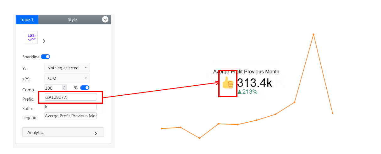
- To incorporate a symbol, insert the HTML Unicode (UTF-8) code into the suffix field. For instance,
👍represents the thumbs-up 👍 symbol. This code will represent the symbol you desire, enhancing the visual presentation of the data on the card.
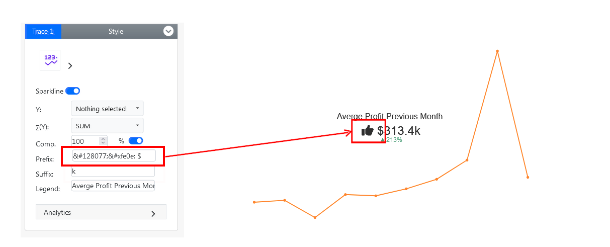
- You have the option to tailor the color and style of the HTML Unicode by incorporating the code
︎︎. - Furthermore, you can also append additional suffixes, such as '$', to the primary value.
Final Adjustments:
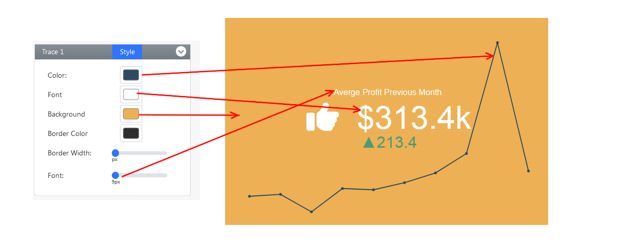
Customize the card’s font size, color, and background.
Below are the essential steps for customizing color, font, and background:
- Under the table labeled "Style" Select the color option: Utilize a color picker from predefined options to designate your preferred font, foreground and background color for the card.
- Select the font size: Use the font selection slider box to specify the desired font size for the card title
Card Visualization Example
Whether seeking inspiration or conducting a quick review of your clients, a pre-made sample page can jumpstart your project. Leveraging Card Visualization for creating dashboards simplifies the process like never before..
Conclusion
Card visualizations, Tile Visualization or the Large Number tiles, with their ability to distill complex data into actionable insights, are indispensable tools for modern businesses. By harnessing the capabilities of the Dashboard Builder, organizations can effortlessly create and customize Large Number tiles to suit their specific needs. Whether it's monitoring financial performance, tracking operational efficiency, or measuring customer satisfaction, Large Number tiles offer a streamlined approach to data visualization and interpretation.
Empower your organization with the clarity and precision of Card visualizations, created effortlessly using the Dashboard Builder.