Unlock the Power of Drill-Through Charts: A Step-by-Step Guide to Effortless Creation of Drill-Through Charts
Drill Through charts are powerful tools in data visualization that allow users to dig deeper into specific data points with just a click. By drilling through layers of data, you can uncover detailed insights without overwhelming the main dashboard. Whether you’re tracking business performance or analyzing customer trends, Drill Through charts enable a more interactive and comprehensive understanding of complex data. In this blog, we’ll guide you through the process of creating your own Drill Through chart step by step, making it easier than ever to enhance your data analysis.
In today’s data-driven world, visualizing complex information efficiently is crucial, and that’s where Drill Through charts come into play. A Drill Through chart allows users to dive deeper into data, offering interactive insights by enabling them to click on a specific part of a chart and reveal detailed data behind it. Whether you're analyzing sales trends or operational performance, Drill Through charts make it easier to explore data layers without cluttering the dashboard. In this guide, we’ll walk you through the benefits and provide a step-by-step process to easily create your own Drill Through chart, transforming how you visualize data.
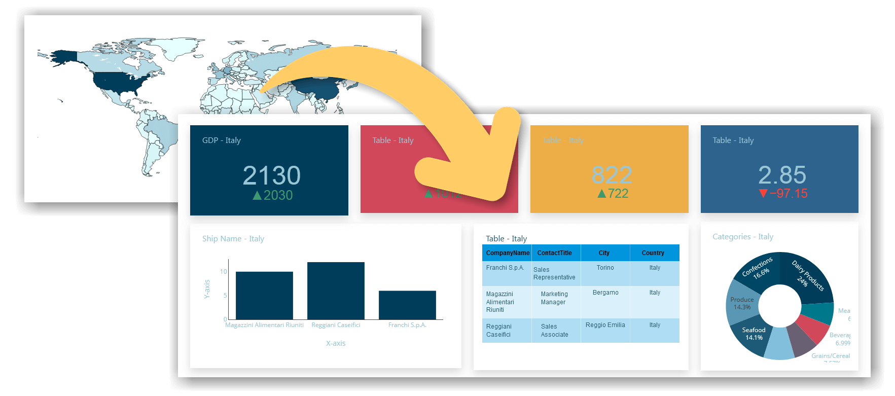
Introduction to Drill-Through Charts
In the realm of data visualization, Drill-Through charts are invaluable for users seeking to delve deeper into their datasets. These charts enable interactive exploration by allowing users to click on specific data points and reveal detailed information that is otherwise hidden. This functionality is particularly useful for understanding complex data and uncovering trends or insights that are not immediately visible.
Drill-Through charts are designed to provide a more granular view of data. For instance, a high-level sales report might show total sales by region. By using a Drill Through chart, a user can click on a particular region to see a breakdown of sales by individual stores or products within that region. This interaction not only enhances the depth of analysis but also keeps the primary dashboard uncluttered by focusing on specific details only when needed.
The concept of Drill Through charts hinges on data hierarchy and the ability to navigate through different levels of data seamlessly. Typically, these charts are linked to a database or a data warehouse that stores hierarchical data, allowing users to drill down from summary information to more detailed layers. This hierarchical approach helps in maintaining a clear and organized view of data while providing the flexibility to explore specific details as required.
Drill-Down vs. Drill-Through: Understanding the Key Differences
Both drill-down and drill-through functionalities serve as essential methods for exploring data, but they are used in distinct ways and provide different levels of insight. Understanding the difference between these two techniques is crucial for leveraging them effectively in your analysis.
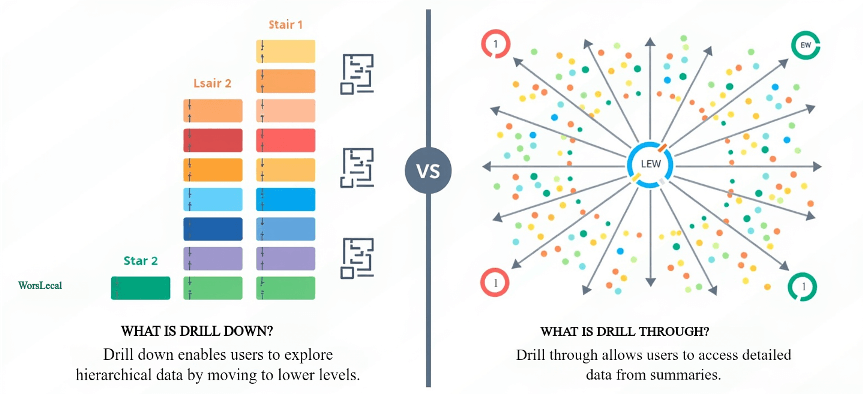
Drill-Down: Zooming In for Deeper Detail
Drill-down allows users to start at a summary level of data and progressively zoom into more detailed levels within the same dataset. It is a hierarchical process, where users click on a high-level view (such as total sales by region) and then drill down to see more specific data points (e.g., sales by city, store, or even individual products). This method is ideal for discovering granular information within a single dataset, as it maintains the same context while presenting more detailed layers.
For example, in a financial dashboard, a drill-down might show a company's overall revenue, and by drilling down, users can see the revenue by product line, and then further into revenue by individual products.
Drill-Through: Moving Across Datasets for Contextual Insights
On the other hand, drill-through is designed to take users from one view or report to another, often crossing over into different datasets or reports. Instead of merely zooming into deeper layers of the same data, drill-through offers a transition to a different dashboard or report altogether, providing additional context or related information.
For instance, a user may start on a sales performance dashboard, click on a specific region, and be redirected (drill-through) to a customer satisfaction report for that region. This method gives a broader perspective and is ideal for exploring related but separate aspects of the data, which can provide a more comprehensive analysis.
Key Differences in Use Cases
- Drill-Down is most effective when you need to explore finer details within a single dataset, helping users uncover specific insights by navigating through hierarchical data levels.
- Drill-Through is used when you need to link to another report or dataset for a broader, more contextual view, allowing users to investigate a different aspect of the data without losing context.
In summary, both techniques are invaluable for data exploration, but they serve distinct purposes. Drill-down is about zooming deeper into data hierarchies, while drill-through is about transitioning between different datasets or reports for a wider range of insights.
Benefits of Using Drill-Through Charts
Drill-Through charts offer a range of benefits that enhance data analysis and visualization. One of the primary advantages is their ability to provide detailed insights without cluttering the main dashboard. By allowing users to click on specific data points and reveal additional layers of information, Drill-Through charts maintain a clean and concise overview while offering depth when needed. This interactive approach helps users focus on high-level summaries and dive deeper into areas of interest, facilitating a more targeted and efficient analysis process.
Another significant benefit of Drill-Through charts is their capacity to uncover trends and patterns that might otherwise remain hidden in aggregated data. For instance, a sales performance chart showing total revenue by region can reveal underlying issues or opportunities when users drill down into individual sales transactions or product categories. This capability enables more granular analysis, helping organizations identify specific areas for improvement or growth. Overall, Drill-Through charts empower users to explore data dynamically, leading to more informed decisions and a better understanding of complex datasets.
Key Features of Drill-Through Charts
- Interactive Data Exploration:: One of the standout features of Drill-Through charts is their interactive nature. Users can click on a data point to drill down into more detailed levels of information. This interactivity allows for a more engaging and intuitive data exploration experience, enabling users to navigate through different data layers effortlessly.
- Data Hierarchy and Drill Paths: Drill-Through charts are built on a hierarchical structure, allowing users to drill down through various levels of data. For example, a chart might start with high-level summary data and enable users to drill through to more detailed metrics, such as regional sales figures or individual product performance. This hierarchical approach helps in organizing data effectively and maintaining clarity.
- Dynamic Filtering: As users interact with Drill-Through charts, the displayed data dynamically updates based on their selections. This real-time filtering ensures that users see only the relevant details corresponding to their current focus, enhancing the accuracy and relevance of the information being analyzed.
- Customizable Drill Paths: Drill-Through charts allow for customization of drill paths, enabling users to define how they want to explore data. This flexibility means that different users can set up drill-through options according to their specific analytical needs, providing a tailored experience.
- Improved Data Discovery: By offering a way to explore data in layers, Drill-Through charts facilitate the discovery of hidden patterns and trends. Users can uncover insights that might not be apparent from high-level summaries, leading to more informed decision-making and a deeper understanding of the data.
These features collectively enhance the functionality of Drill-Through charts, making them powerful tools for detailed and interactive data analysis.
Best Practices for Creating Drill-Through Charts
Creating effective Drill-Through charts requires careful planning and thoughtful design to ensure they deliver the most valuable insights. Here are some best practices to follow:
1. Define Clear Data Hierarchies
Ensure that your data is structured in a clear hierarchy that makes sense for drill-through functionality. Start with high-level summary data (e.g., total sales, overall performance) and allow users to drill into more specific data points, such as regional sales, product-level performance, or customer segments. Properly defining these levels makes it easier for users to navigate and explore the data.
2. Use Relevant Drill-Through Fields
Choose drill-through fields that add meaningful value to your analysis. The data points you allow users to drill into should provide deeper, actionable insights, rather than just more granular details. For instance, allowing a user to drill down from "Total Sales" to "Sales by Product Category" is useful, while drilling into overly specific or irrelevant details could overwhelm the user.
3. Ensure Seamless User Experience
The drill-through functionality should feel natural and intuitive. Label clickable data points clearly so that users know where they can drill down. Also, make sure the transition from the main chart to the drill-through page is smooth, providing context and maintaining consistency in design and layout. Use breadcrumbs or easy navigation options so users can move back and forth without confusion.
4. Limit the Number of Drill-Through Levels
While Drill-Through charts offer powerful exploration capabilities, too many drill-down levels can overwhelm the user. Stick to 2-3 levels of drill-through data to maintain clarity and focus. Providing too many layers of data could make navigation cumbersome and reduce the overall effectiveness of the chart.
5. Customize and Format Your Drill-Through Charts for Readability
Use consistent formatting and chart types across your drill-through pages. A sudden change in chart type or color scheme can confuse users and make data harder to interpret. Additionally, ensure that your drill-through charts are optimized for readability with clear labels, legends, and tooltips that explain the data.
6. Optimize Performance with Efficient Data Queries
Drill-Through charts rely on real-time data queries, so performance is critical. Optimize your data connections and queries to ensure fast load times as users navigate between data layers. Slow performance can frustrate users and make the drill-through experience less efficient.
7. Test the Drill-Through Experience
Before finalizing the chart, test the entire drill-through flow from the user’s perspective. Make sure the right fields and data levels are being displayed, and that users can easily interpret the insights. Testing ensures that the drill-through experience is both functional and valuable.
8. Provide Contextual Information
As users drill down into more detailed data, include context in the drill-through pages. Use headings, descriptions, or notes to explain the relationship between the high-level summary and the detailed data. Providing context helps users better understand the story behind the data, especially when they move between different data layers.
By following these best practices, you can create Drill-Through charts that are not only interactive but also intuitive, efficient, and insightful, helping users explore data dynamically while maintaining clarity and focus.
Detailed Drill-Down Exploration: Delving into Deeper Data Layers
The real value lies in the ability to drill down into your data, moving beyond surface-level summaries to uncover more granular, hidden insights. The Drill-Down functionality enables users to start their analysis with a high-level view—such as overall sales, regional performance, or customer segments—and progressively zoom into specific details like individual transactions, customer behavior, or product performance.
Dynamic Interaction for Focused Insights
One of the key strengths of Drill-Down exploration is its dynamic interaction with your data. Instead of overwhelming users with too much information upfront, it allows for a structured, step-by-step exploration. For instance, a sales dashboard showing overall performance by region can be drilled into further to reveal individual stores or product categories within that region. This targeted approach makes it easy to identify opportunities or pinpoint areas of concern without sifting through endless amounts of data.
This flexibility is crucial for business leaders and analysts who need to navigate between high-level trends and detailed data points effortlessly. Whether it’s breaking down financial metrics or drilling into customer demographics, Drill-Down functionality empowers users to discover relevant insights quickly and efficiently.
Uncover Hidden Patterns and Anomalies
Drill-Down exploration also plays an essential role in investigating anomalies and unusual patterns. For example, if a dashboard shows an unexpected spike in sales during a specific month, Drill-Down allows you to isolate the exact products, regions, or customer segments contributing to this change. Was there a particular promotion driving this spike, or did external market factors play a role? By zooming into the finer details, you can get answers that guide strategic decisions.
Moreover, when analyzing trends over time, Drill-Down charts help uncover long-term patterns or hidden correlations that could otherwise be missed. Instead of making assumptions based on aggregate data, decision-makers can make more informed choices by fully understanding the underlying factors driving these trends.
Simplified Exploration for Complex Datasets
Drill-Down functionality also brings simplicity to complex datasets. By starting with a clean, high-level view and allowing users to dive deeper only when necessary, dashboards remain uncluttered and easy to navigate. This approach enhances user experience by focusing on the most critical data first, while still providing the flexibility to explore further when needed.
Drill-Down exploration strikes a balance between simplicity and depth, providing users with the power to perform detailed investigations without losing sight of the bigger picture. This structured data exploration helps analysts and decision-makers act swiftly and confidently, driving business growth and optimizing performance based on a clear understanding of the insights.
Exploring an Alternative to Power BI Drill-Through: The Dashboard Builder
When it comes to data visualization and in-depth analysis, Power BI is often a top choice for businesses looking to leverage drill-through charts. However, there are effective alternatives like Dashboard Builder, which offer similar functionalities with added flexibility and simplicity. Both tools enable users to explore data dynamically by drilling down into detailed views from high-level summaries, but the Dashboard Builder stands out for its ease of use, cost-effectiveness, and versatility, making it an excellent alternative to Power BI Drill-Through.
Key Differences Between Power BI Drill-Through and Dashboard Builder Drill-Through
- Ease of Setup: Power BI requires users to have some technical knowledge for setting up drill-through functionality, involving creating multiple report pages and linking filters. In contrast, Dashboard Builder offers a more user-friendly setup, even for those with limited technical expertise. With just a few clicks, users can add drill-through options, configure their main and secondary charts, and enable seamless navigation between data layers without needing to design complex report pages.
- Cost Efficiency: Power BI's licensing costs can be a significant factor for many organizations. With its subscription model, users may find themselves paying more depending on the number of reports, data usage, or sharing requirements. Dashboard Builder, on the other hand, provides a more affordable solution, especially for small-to-medium-sized businesses, without sacrificing the essential functionality of drill-through charts. This makes Dashboard Builder a budget-friendly alternative while offering similar capabilities for dynamic data exploration.
- Flexibility and Customization: Power BI is a powerful tool, but its drill-through customization can be more rigid, with predefined hierarchies and a set structure for reports. Dashboard Builder allows for more flexible drill paths, offering customization options tailored to your specific data needs. Users can define their drill paths and fields easily, providing more control over how data is explored and visualized. This adaptability makes Dashboard Builder a good choice for organizations that need a tool to fit into their existing workflows without requiring extensive customization efforts.
- Performance: Power BI can sometimes face performance issues, especially with large datasets, causing slower loading times for drill-through interactions. Dashboard Builder is optimized for real-time performance, ensuring quick and responsive navigation between data layers. This makes Dashboard Builder ideal for businesses that need fast, real-time insights without delay.
In summary, while Power BI remains a powerful player in the business intelligence space, Dashboard Builder provides an effective alternative for those looking for a more cost-efficient, flexible, and user-friendly tool. Both platforms offer robust drill-through functionality, but Dashboard Builder caters to organizations seeking an easy-to-use solution that still delivers detailed insights and interactive data exploration.
Step-by-Step Guide to Create a Drill-Through Chart Using the Dashboard Builder
Creating a Drill-Through chart in your dashboard builder is easier than you might think, and it can greatly enhance your ability to explore data in depth. This feature allows users to click on data points and drill down into more specific details without overloading the main chart. Whether you're analyzing sales trends or operational performance, this step-by-step guide will walk you through the entire process of setting up a Drill-Through chart, from logging into your dashboard builder to configuring your charts and enabling drill paths. Let's get started!
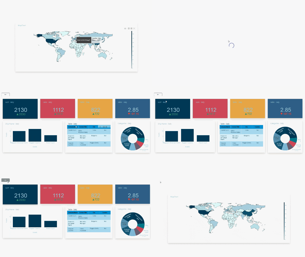
Assumption: Dashboard Builder 7.2 or higher version is already installed
Requirements
The Dashboard Builder can be installed any platforms like Windows, Linux, Mac and Ubuntu or any other platforms support Apache.
- Dashboard Builder 7.2 or higher version
- PHP Version 7.2 or later
- Apache 2 or later
- Windows 7 or later /Linux 3 or later
- Firefox 52, Chrome 57, Edge
Installation
- Download from https://dashboardbuilder.net/download-free-dashboard
- Place the files in a directory on the web server. e.g. …/www/dashboar/dbuilder/
1. Log in to Your Dashboard Builder
- Start by logging into your dashboard builder with your credentials to access the platform's data visualization and chart creation tools.
2. Edit and Add Drill-Through Option
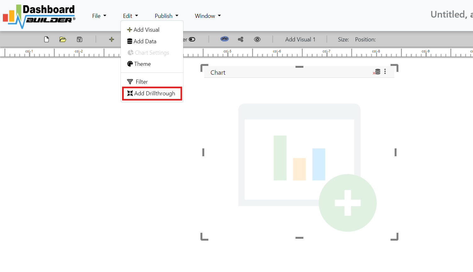
- Once logged in, navigate to the Edit section.
- Click on the "Add Drill-Through" option. This action will automatically create a new page dedicated to drill-through data.
3. Set the Window and Main View
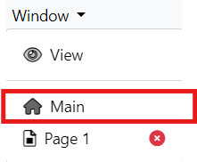
- Click on the Window tab and then select "Main" to begin configuring your primary chart.
4. Connect Your Data Source
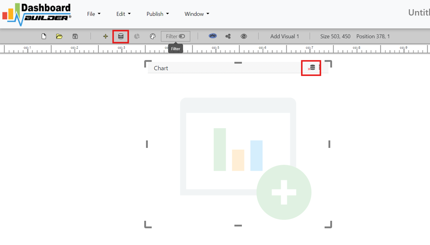
- Before designing your chart, ensure that you have connected the appropriate data source. This could be any dataset that supports drill-through functionality, such as sales or performance metrics.
5. Create a New Chart
- You can now create a new chart by selecting "Edit" and then navigating to "Chart Settings" or just click on the visual panel.
6. Customize Your Main Chart
- In the Chart Settings, configure your main chart based on your analysis needs. Set up fields, data points, and design preferences that suit your reporting requirements.
7. Enable Drill-Through in the Main Chart
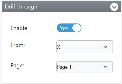
- In the Chart Settings layout, you will find the "Drill-Through" tab. Enable this option to activate the drill-through functionality.
- Select the appropriate field (the one that will be clickable for deeper insights) and link it to the newly created page.
8. Configure the Drill-Through Settings for the New Page
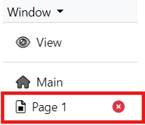
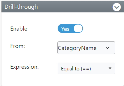
- Go to the new page by clicking Window and selecting Page..
- In the Chart Settings layout on this page, navigate to the Drill-Through tab..
- Enable the drill-through functionality again and select the correct field and expression for data drilling.
9. Save Your Settings
- After configuring the main chart and the drill-through settings, ensure you save all settings to apply the changes.
10. You're Done!
- Now your Drill-Through chart is set up and ready to provide interactive insights. Users can click on specific data points in the main chart to drill into deeper, more detailed data on the new page.
Conclusion
Drill-Through charts are powerful tools that transform the way you analyze and interact with data. By allowing users to dive deeper into specific data points with just a click, these charts provide actionable insights without cluttering the main dashboard. The ability to explore data at multiple levels helps uncover hidden patterns, trends, and opportunities that might otherwise go unnoticed, making Drill-Through charts an essential feature for data-driven decision-making.
With the Dashboard Builder, creating and managing Drill-Through charts becomes an intuitive and straightforward process. From setting up data hierarchies to customizing chart settings, the platform streamlines every step, enabling even non-technical users to build interactive, detailed visualizations effortlessly. By following the best practices outlined and leveraging the flexibility of the Dashboard Builder, you can create highly effective Drill-Through charts that enhance your data analysis and empower you to make more informed decisions.
Empower your organization with the clarity and depth of Drill-Through charts, effortlessly created using the Dashboard Builder for precise and interactive data exploration.
How helpful was this information?
Related topics
- Unlock the Power of Drill-Through Charts: A Step-by-Step Guide to Effortless Creation of Drill-Through Charts
- Introduction to Drill-Through Charts
- Drill-Down vs. Drill-Through: Understanding the Key Differences
- Benefits of Using Drill-Through Charts
- Key Features of Drill-Through Charts
- Best Practices for Creating Drill-Through Charts
- 1. Define Clear Data Hierarchies
- 2. Use Relevant Drill-Through Fields
- 3. Ensure Seamless User Experience
- 4. Limit the Number of Drill-Through Levels
- 5. Customize and Format Your Drill-Through Charts for Readability
- 6. Optimize Performance with Efficient Data Queries
- 7. Test the Drill-Through Experience
- 8. Provide Contextual Information
- Detailed Drill-Down Exploration: Delving into Deeper Data Layers
- Exploring an Alternative to Power BI Drill-Through: The Dashboard Builder
- Key Differences Between Power BI Drill-Through and Dashboard Builder Drill-Through
- Step-by-Step Guide to Create a Drill-Through Chart Using the Dashboard Builder
- 1. Log in to Your Dashboard Builder
- 2. Edit and Add Drill-Through Option
- 3. Set the Window and Main View
- 4. Connect Your Data Source
- 5. Create a New Chart
- 6. Customize Your Main Chart
- 7. Enable Drill-Through in the Main Chart
- 8. Configure the Drill-Through Settings for the New Page
- 9. Save Your Settings
- 10. You're Done!
- Video tutorial on how to create a Drill-Through Chart Using the Dashboard Builder®
- Conclusion
- How helpful was this information?